Mastering buttons in SwiftUI
Button is one of the regularly used components in SwiftUI. We use buttons to allow users to produce actions. That’s why it is so essential to generalize the look and feel of buttons in our apps. This week we will master buttons in SwiftUI. We will learn how to customize the look and feel of our buttons.
Compare designs, show rulers, add a grid, quick actions for recent builds. Create recordings with touches & audio, trim and export them into MP4 or GIF and share them anywhere using drag & drop. Add bezels to screenshots and videos. Try now
Basic usage
Let’s start by presenting a simple button that prints something in the console whenever the user presses it.
struct RootView: View {
    var body: some View {
        Button("Button 1") {
            print("Button 1")
        }
    }
}

Pretty easy, right? Now we can move forward, I want to style my buttons in Apple way. Buttons should be filled with the accent color of my app and have a corner radius. Let’s take a look at the quick implementation.
Button("Button 2") {}
    .foregroundColor(.white)
    .padding()
    .background(Color.accentColor)
    .cornerRadius(8)

Now my button looks like I need, but my app has a lot of actions represented by buttons, and I don’t want to copy-paste these styling code every time. We can solve the issue by introducing a new view.
struct FilledButton: View {
    let title: String
    let action: () -> Void

    var body: some View {
        Button(title, action: action)
            .foregroundColor(.white)
            .padding()
            .background(Color.accentColor)
            .cornerRadius(8)
    }
}
Now we can use FilledButton everywhere in the app. We create a new view that renders our button, but this approach has one downside. We can’t modify the label of our button. For example, we can’t change the text color while the user presses the button.
ButtonStyle protocol
SwiftUI allows us to customize buttons in our apps without introducing new views or copy-pasting the styling code. SwiftUI provides the special ButtonStyle protocol. We can implement FilledButton struct that conforms to ButtonStyle instead of View protocol. Let’s see what benefits we have by using ButtonStyle protocol.
struct FilledButton: ButtonStyle {
    @Environment(\.isEnabled) private var isEnabled

    func makeBody(configuration: Configuration) -> some View {
        configuration
            .label
            .foregroundColor(configuration.isPressed ? .gray : .white)
            .padding()
            .background(isEnabled ? Color.accentColor : .gray)
            .cornerRadius(8)
    }
}
As you can see in the example above, ButtonStyle protocol has the only one requirement. We need to implement makeBody function. This function provides a configuration that we can use to obtain the label of the button and understand whenever it is pressed or not. I have to mention that we also have access to the environment inside the FilledButton type.
Button("Button 1") {}
    .buttonStyle(FilledButton())
Custom behavior with button styles
Button styles can change the button instance drastically. For example, we can make a button style that accepts a boolean value and shows an activity indicator depending on that value.
struct ProgressButtonStyle: ButtonStyle {
    let isLoading: Bool

    func makeBody(configuration: Configuration) -> some View {
        configuration.label
            .opacity(isLoading ? 0 : 1)
            .overlay {
                if isLoading {
                    ProgressView()
                }
            }
    }
}

struct ContentView: View {
    @State private var isLoading = true

    var body: some View {
        Button("Download") {
            isLoading.toggle()
        }.buttonStyle(ProgressButtonStyle(isLoading: isLoading))
    }
}
Button styles and environment
Another benefit of ButtonStyle protocol is the ability to set it in the environment. It means we don’t need to set a button style manually for every button. SwiftUI will automatically apply it whenever we configure it for the current environment. Let’s take a look at the small example.
import SwiftUI
struct RootView: View {
var body: some View {
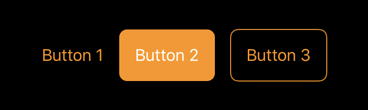
HStack(spacing: 16) {
Button("Button 1") {}
Button("Button 2") {}
Button("Button 3") {}
}
}
}
import PlaygroundSupport
let rootView = RootView()
.accentColor(.orange)
.buttonStyle(FilledButton())
PlaygroundPage.current.setLiveView(rootView)
After setting a button style in the environment, we don’t need to configure our buttons again. SwiftUI will apply that styling options by default. I want to mention that you can easily override any button or environment style by directly calling the buttonStyle modifier again.
struct OutlineButton: ButtonStyle {
    func makeBody(configuration: Configuration) -> some View {
        configuration
            .label
            .foregroundColor(configuration.isPressed ? .gray : .accentColor)
            .padding()
            .background(
                RoundedRectangle(
                    cornerRadius: 8,
                    style: .continuous
                ).stroke(Color.accentColor)
        )
    }
}

struct RootView: View {
    var body: some View {
        HStack(spacing: 16) {
            Button("Button 1") {}

            Button("Button 2") {}
                .buttonStyle(OutlineButton())

            Button("Button 3") {}
        }
    }
}

import PlaygroundSupport

let rootView = RootView()
    .accentColor(.orange)
    .buttonStyle(FilledButton())
PlaygroundPage.current.setLiveView(rootView)
SwiftUI uses environment to pass system-wide and application-related information. You can also populate environment with your custom objects. To learn more about environment, take a look at my “The power of Environment in SwiftUI” post.
PrimitiveButtonStyle protocol
Sometimes we need to implement super custom buttons. For example, assume that we need a button that acts only after a long press. We can’t achieve that with ButtonStyle protocol because it doesn’t provide us control on triggering the button action. Instead, SwiftUI gives us PrimitiveButtonStyle protocol that looks very similar to ButtonStyle but provides all the needed API to build a super custom button. Let’s build our button that acts after a long press.
struct LongPressButton: PrimitiveButtonStyle {
    func makeBody(configuration: Configuration) -> some View {
        configuration
            .label
            .gesture(
                LongPressGesture()
                    .onEnded { _ in configuration.trigger() }
        )
    }
}
As you can see in the example above, PrimitiveButtonStyle looks very similar to our good friend ButtonStyle, but instead of isPressed property configuration provides us a trigger closure that represents the action of the button. We can trigger the button using that closure whenever we want. We can apply our PrimitiveButtonStyle in the same way by using the buttonStyle modifier.
Conclusion
This week we learned a few ways of customizing buttons in our apps. I am delighted with this protocol based styling approach in SwiftUI and love it. I hope you enjoy the post. Feel free to follow me on Twitter and ask your questions related to this post. Thanks for reading, and see you next week!