Blur effect and materials in SwiftUI
SwiftUI has the blur view modifier from the very first day. It allows us to build super custom blur effects quickly. On the other hand, SwiftUI Release 3 gives us the new Material type that specifies different blur effects defined in Human Interface Guidelines. This week we will learn how to use the blur view modifier and the new Material type to build translucent effects.
Compare designs, show rulers, add a grid, quick actions for recent builds. Create recordings with touches & audio, trim and export them into MP4 or GIF and share them anywhere using drag & drop. Add bezels to screenshots and videos. Try now
Basics
Let’s start with learning how to use the blur view modifier in SwiftUI. All you need to do is to apply the view modifier to any view you want to blur.
import SwiftUI

struct ContentView: View {
    var body: some View {
        ZStack {
            LinearGradient(
                colors: [.red, .yellow],
                startPoint: .top,
                endPoint: .bottom
            ).ignoresSafeArea()

            Text("Hello")
                .padding()
                .background {
                    Color.black
                        .blur(radius: 8, opaque: false)
                }
        }
    }
}
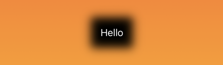
As you can see in the example above, we create a Text view with a black background. Next, we add the *blur view modifier to apply a gaussian blur effect to the rendering of this view. The blur view modifier has two parameters that allow us to customize the produced result. The first one is the radius that defines the radial size of the blur effect. The second one is the bool value that specifies whether the renderer allows transparency. By default, it is false.
To learn more about gradients in SwiftUI, take a look at my “Gradient in SwiftUI” post.
Materials
Apple provides us with a collection of materials. Material is ready to use translucent blur effect. You can use it to achieve a feeling of depth. Materials allow you to blur the background without changing the foreground content.
SwiftUI has a set of standard materials that allow you to make your views look magnificent in any context. These effects automatically support both the light and dark modes. Let’s take a look at how we can use them.
import SwiftUI

struct ContentView: View {
    var body: some View {
        ZStack {
            LinearGradient(
                colors: [.red, .yellow],
                startPoint: .top,
                endPoint: .bottom
            ).ignoresSafeArea()

            Text("Hello")
                .padding()
                .background(
                    .regularMaterial,
                    in: RoundedRectangle(cornerRadius: 8, style: .continuous)
                )
        }
    }
}
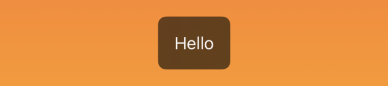
As you can see in the example, we use the background view modifier with regular material. Material isn’t a view, but attaching material is similar to inserting a translucent layer between the view and its background. The blurring effect produced by the material isn’t simple transparency. It uses an environment-defined mixing that produces a result that matches glass.
import SwiftUI

struct ContentView: View {
    var body: some View {
        ZStack {
            LinearGradient(
                colors: [.red, .yellow],
                startPoint: .top,
                endPoint: .bottom
            ).ignoresSafeArea()

            Text("Hello")
                .padding()
                .background(
                    .ultraThickMaterial,
                    in: RoundedRectangle(cornerRadius: 8, style: .continuous)
                )
        }
    }
}
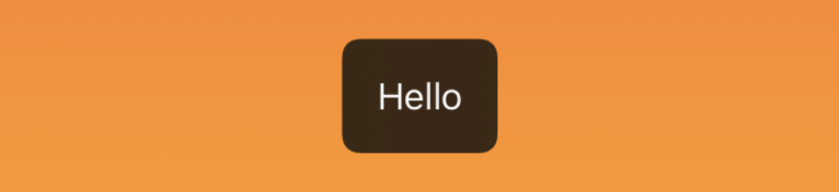
SwiftUI has a set of materials with different thicknesses. Thicker materials have better contrast for text and other views.
- regular material
- thin material
- ultra-thin material
- thick material
- ultra-thick material
Remember that a material blurs the app’s background, but not the content behind the app on the screen. For example, the content on the Home Screen doesn’t affect the appearance of a widget.
Conclusion
This week we learned how to use the blur effect and system-provided materials defined in Human Interface Guidelines. Now you can go back and make your apps more vibrant by using new materials available in SwiftUI Release 3. I hope you enjoy the post. Feel free to follow me on Twitter and ask your questions related to this post. Thanks for reading, and see you next week!