visionOS ornaments in SwiftUI
The new Apple Vision Pro device is almost here, and SwiftUI is the best way to build a visionOS app quickly and natively. This week, we will continue the topic of the new SwiftUI APIs that we can use to adapt our apps to visionOS. We will learn about the new user interface component called ornaments.
Compare designs, show rulers, add a grid, quick actions for recent builds. Create recordings with touches & audio, trim and export them into MP4 or GIF and share them anywhere using drag & drop. Add bezels to screenshots and videos. Try now
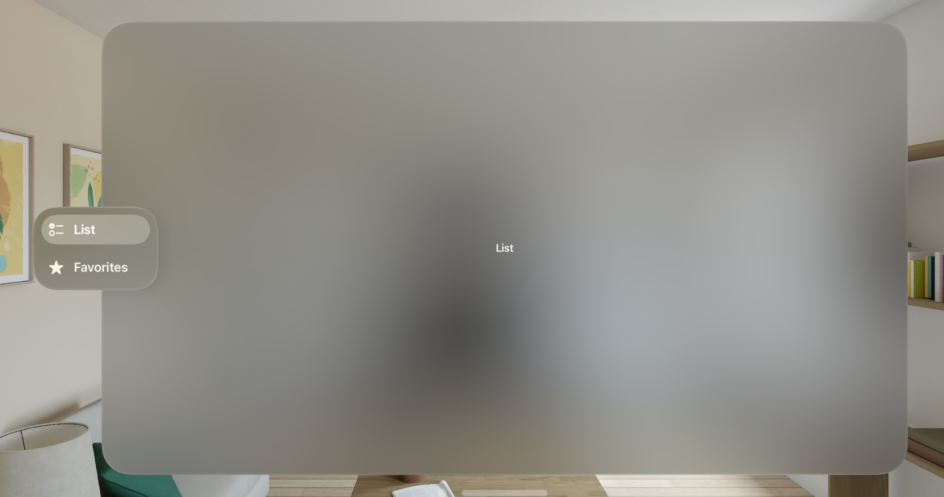
In visionOS, an ornament presents controls and information related to a window without crowding or obscuring the window’s contents. visionOS uses ornaments to display toolbars, tab bars, etc. But you can build your custom ornaments too. Let’s start by creating our first ornament using old but gold TabView.
struct ExampleView1: View {
    var body: some View {
        TabView {
            Text("List")
                .tabItem {
                    Label("List", systemImage: "checklist")
                }

            Text("Favorites")
                .tabItem {
                    Label("Favorites", systemImage: "star")
                }
        }
    }
}
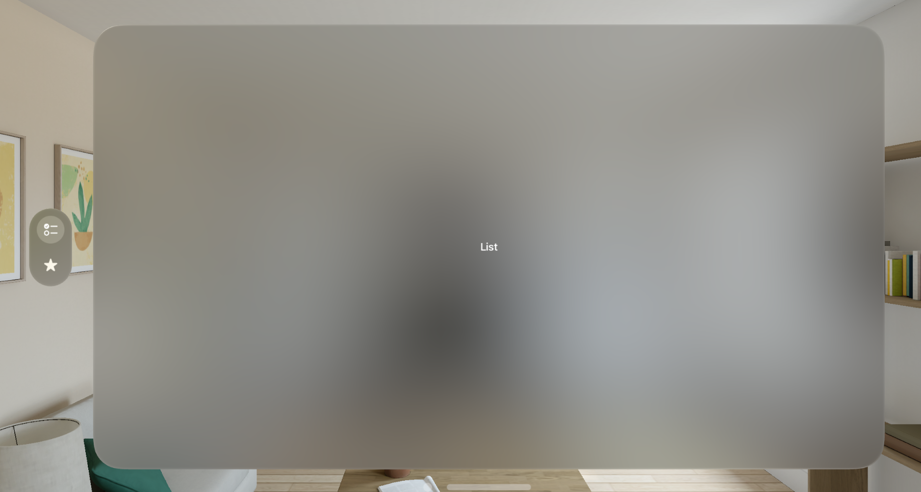
As you can see in the example above, we don’t do something special. We use the TabView that the SwiftUI framework offers us from the very first version. This is another place where the magic of the declarative framework works seamlessly. SwiftUI automatically adapts its environment and creates an ornament to display the tab bar. We can’t control the ornament that the system creates, and it provides us with default behavior while we hover it.
TabView automatically creates an ornament to provide us access to navigation in a very native way. We can also use the Toolbar API that the SwiftUI framework provides to build another type of ornament.
struct ExampleView2: View {
    var body: some View {
        Text("Hello World")
            .toolbar {
                ToolbarItem(placement: .bottomOrnament) {
                    Button("New", systemImage: "pencil") {
                        // new action
                    }
                }

                ToolbarItem(placement: .bottomOrnament) {
                    Button("Save", systemImage: "square.and.arrow.down") {
                        // save action
                    }
                }
            }
    }
}
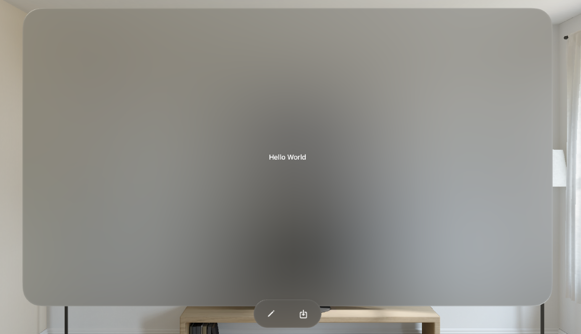
In the example above, we use the Toolbar API to place action controls in an ornament. The ToolbarPlacement type provides us the bottomOrnament property, allowing us to place controls in the ornament below the window. While adapting your app to visionOS, you might need different toolbar placements depending on the platform. In this case, you can use conditional compilation directives to provide the particular placement.
struct ExampleView2: View {
    var body: some View {
        Text("Hello World")
            .toolbar {
                ToolbarItem(placement: placement) {
                    Button("New", systemImage: "pencil") {
                        // new action
                    }
                }

                ToolbarItem(placement: placement) {
                    Button("Save", systemImage: "square.and.arrow.down") {
                        // save action
                    }
                }
            }
    }

    private var placement: ToolbarItemPlacement {
        #if os(visionOS)
        return .bottomOrnament
        #else
        return .primaryAction
        #endif
    }
}
We learned how easily SwiftUI creates ornaments to adapt the look and feel of visionOS. But we can go further and create custom ornaments to control its position, look, and feel. SwiftUI provides the ornament view modifier, allowing us to develop super-custom ornament.
struct ContentView: View {
    var body: some View {
        Text("Hello World!")
            .ornament(
                visibility: .visible,
                attachmentAnchor: .scene(.bottomTrailing),
                contentAlignment: .bottom
            ) {
                VStack {
                    Button("New", systemImage: "pencil") {
                        // new action
                    }

                    Button("Save", systemImage: "square.and.arrow.down") {
                        // save action
                    }
                }
                .labelStyle(.iconOnly)
                .padding(.vertical)
                .glassBackgroundEffect()
            }
    }
}
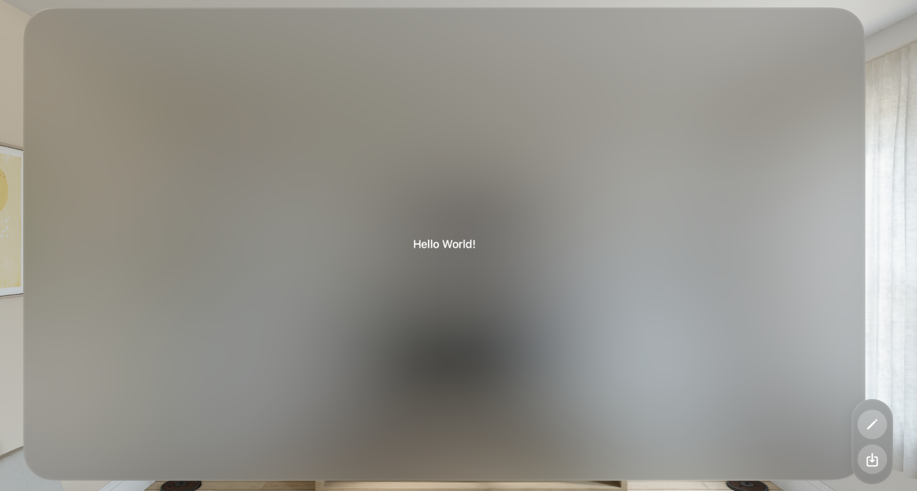
As you can see in the example above, we use the ornament view modifier. The ornament view modifier takes a set of parameters. The visibility parameter allows us to control when the framework displays the ornament. We can hide it by passing the hidden value.
The attachmentAnchor parameter allows us to control the position of the ornament. It will enable us to define the point of the scene where we want to attach the ornament.
The contentAlignment parameter allows us to define which point of the ornament framework should use while calculating its attachment point in conjuction with the attachmentAnchor parameter.
The last parameter of the ornament view modifier is the ViewBuilder closure, which allows us to provide the content of the ornament. As you can see, we also use the glassBackgroundEffect view modifier to add the visionOS-styled background to our content.
Today, we learned how to use the SwiftUI framework to improve the user experience of our apps on visionOS by using the new ornament concept. I hope you enjoy the post. Feel free to follow me on Twitter and ask your questions related to this post. Thanks for reading, and see you next week!