Glassifying custom SwiftUI views
We already talked about glassifying tabs and toolbars in SwiftUI. This week, we will continue the topic of the new Liquid Glass design language and will talk about applying this concept to custom views.
Compare designs, show rulers, add a grid, quick actions for recent builds. Create recordings with touches & audio, trim and export them into MP4 or GIF and share them anywhere using drag & drop. Add bezels to screenshots and videos. Try now
The SwiftUI framework introduced the glassEffect view modifier. We can apply it to any view to enable glass effect. You should keep in mind that glass effect is not a simple background. It interacts with the views behind it and changes its properties. Even more, it can change the color scheme of your view from light to dark depending on the content behind it.
struct CustomView: View {
    var body: some View {
        ScrollView {
            Color.red.frame(height: 300)
            Color.yellow.frame(height: 300)
            Color.green.frame(height: 300)
            Color.black.frame(height: 300)
            Color.orange.frame(height: 300)
            Color.blue.frame(height: 300)
            Color.brown.frame(height: 300)
        }
        .safeAreaInset(edge: .bottom) {
            Text("Hello, World!")
                .padding()
                .glassEffect()
        }
    }
}
As you can see in the example above, we simply add the glassEffect view modifier. That’s it. It takes care of your view and makes it glassy. The SwiftUI framework provides us with a few options while using the glassEffect view modifier.
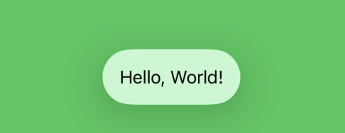
There are three options at the moment: regular, clear, and identity. These are the predefined instances of the Glass type. Identity is great whenever you need to conditionally turn off the glass effect.
struct CustomView: View {
    @State private var isEnabled = true

    var body: some View {
        ScrollView {
            Color.red.frame(height: 300)
            Color.yellow.frame(height: 300)
            Color.green.frame(height: 300)
            Color.black.frame(height: 300)
            Color.orange.frame(height: 300)
            Color.blue.frame(height: 300)
            Color.brown.frame(height: 300)
        }
        .safeAreaInset(edge: .bottom) {
            Text("Hello, World!")
                .padding()
                .glassEffect(isEnabled ? .regular : .identity)
        }
        .toolbar {
            Toggle("Glass Effect", isOn: $isEnabled)
        }
    }
}
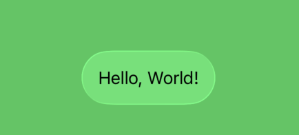
The regular one is the most used across the system. There is also the clear option, which gives you more transparency. All of these glass types can be modified using the tint function.
struct CustomView: View {
    var body: some View {
        ScrollView {
            Color.red.frame(height: 300)
            Color.yellow.frame(height: 300)
            Color.green.frame(height: 300)
            Color.black.frame(height: 300)
            Color.orange.frame(height: 300)
            Color.blue.frame(height: 300)
            Color.brown.frame(height: 300)
        }
        .safeAreaInset(edge: .bottom) {
            Text("Hello, World!")
                .padding()
                .glassEffect(.clear.tint(.red))
        }
    }
}
The tint function blends into the glass the color you provide. There is also the interactive function on the Glass type, allowing us to make any of the provided styles more interactive. By default, all of them reflect the views behind, but whenever you apply the interactive function, it makes them even more aggressive to the content behind and handles gestures like tap and drag.
struct CustomView: View {
    var body: some View {
        ScrollView {
            Color.red.frame(height: 300)
            Color.yellow.frame(height: 300)
            Color.green.frame(height: 300)
            Color.black.frame(height: 300)
            Color.orange.frame(height: 300)
            Color.blue.frame(height: 300)
            Color.brown.frame(height: 300)
        }
        .safeAreaInset(edge: .bottom) {
            Text("Hello, World!")
                .padding()
                .glassEffect(.clear.interactive())
        }
    }
}
The second parameter on the glassEffect view modifier is the shape of the glass. By default, it uses the instance of the DefaultGlassEffectShape. But you can modify it using any shape you need.
struct CustomView: View {
    var body: some View {
        ScrollView {
            Color.red.frame(height: 300)
            Color.yellow.frame(height: 300)
            Color.green.frame(height: 300)
            Color.black.frame(height: 300)
            Color.orange.frame(height: 300)
            Color.blue.frame(height: 300)
            Color.brown.frame(height: 300)
        }
        .safeAreaInset(edge: .bottom) {
            Text("Hello, World!")
                .padding()
                .glassEffect(.clear, in: .circle)
        }
    }
}
Applying the glassEffect view modifier to custom views in SwiftUI is a powerful and simple way to embrace the Liquid Glass design language. With just one line of code, you can give your UI a modern, dynamic look that responds to its surroundings. I hope you enjoy the post. Feel free to follow me on Twitter and ask your questions related to this post. Thanks for reading, and see you next week!