The all-in-one macOS app that enhances App Store Connect, supercharging your app updates, localization, and ASO with AI-powered tools. Save 25% and try now!
We have already discussed the recomposition of simple @ViewBuilder closures like this one.
struct ContentView: View {
var body: some View {
Carousel {
Color.yellow
Color.orange
Color.red
Color.blue
Color.green
}
}
}
Using the new subviews parameter on Group or ForEach views, we can easily access any SwiftUI view’s subviews and recompose them as needed. Now, let’s talk about more complex view hierarchies where you have sections with headers and footers.
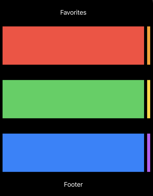
struct ContentView: View {
var body: some View {
Carousel {
Section(header: Text("Favorites")) {
Color.red
Color.orange
}
Section {
Color.green
Color.yellow
}
Section(footer: Text("Footer")) {
Color.blue
Color.purple
}
}
}
}
SwiftUI introduces new APIs, allowing us to recompose complex view hierarchies, including sections. Similarly to the subviews parameter, SwiftUI defines another overload on the ForEach type, allowing us to enumerate sections.
struct Carousel<Content: View>: View {
@ViewBuilder var content: Content
var body: some View {
ScrollView {
LazyVStack {
ForEach(sections: content) { section in
VStack {
section.header
ScrollView(.horizontal) {
LazyHStack {
section.content
.containerRelativeFrame(.horizontal)
.frame(minHeight: 100)
}
.scrollTargetLayout()
}
.scrollIndicators(.hidden)
.scrollTargetBehavior(.viewAligned)
.contentMargins(16)
section.footer
}
}
}
}
}
}
As you can see in the example above, we use the ForEach type with the new initializer, which allows us to decompose sections from the view. In this case, the ForEach view enumerates the sections of the view and provides us access to every section by giving an instance of the SectionConfiguration type.
The SectionConfiguration type is the new SwiftUI type conforming to the Identifiable protocol, which means it has a stable identifier. It also has the header, footer, and content properties of the SubviewsCollection type.
To learn more about basics of the container view APIs in SwiftUI, take a look at my “Mastering container views in SwiftUI. Basics.” post.
The SubviewCollection type provides indexed access to view proxies, allowing us to recompose the view hierarchy easily. Remember that you can treat an instance of the SubviewCollection type as a collection and iterate using the ForEach type or wrap it with another container view like HStack or VStack.
struct Carousel<Content: View>: View {
@ViewBuilder var content: Content
var body: some View {
ScrollView {
LazyVStack {
ForEach(sections: content) { section in
VStack {
section.header
ScrollView(.horizontal) {
LazyHStack {
ForEach(section.content) { subview in
subview
.containerRelativeFrame(.horizontal)
.frame(minHeight: 100)
}
}
.scrollTargetLayout()
}
.scrollIndicators(.hidden)
.scrollTargetBehavior(.viewAligned)
.contentMargins(16)
section.footer
}
}
}
}
}
}
Whenever your view hierarchy doesn’t use sections, it is still accessible via section recomposition APIs. In this case, SwiftUI handles the content as a single section.
As I said before, the new overload on the ForEach type allows us to enumerate decomposed sections from the view. An overloaded initializer on the Group type allows us to transform the sections of the view by accessing them through an instance of the SectionCollection type.
struct Magazine<Content: View>: View {
    @ViewBuilder var content: Content

    var body: some View {
        ScrollView {
            LazyVStack {
                Group(sections: content) { sections in
                    if !sections.isEmpty {
                        sections[0].content.frame(minHeight: 100)
                    }

                    if sections.count > 1 {
                        ForEach(sections[1...]) { section in
                            section.header

                            ScrollView(.horizontal) {
                                LazyHStack {
                                    section.content
                                        .containerRelativeFrame(.horizontal)
                                        .frame(minHeight: 100)
                                }
                            }
                            .contentMargins(16)

                            section.footer
                        }
                    }
                }
            }
        }
    }
}
As you can see in the example above, we use the Group view with sections parameter, which allows us to extract an instance of the SectionCollection type and recompose it using our custom logic.
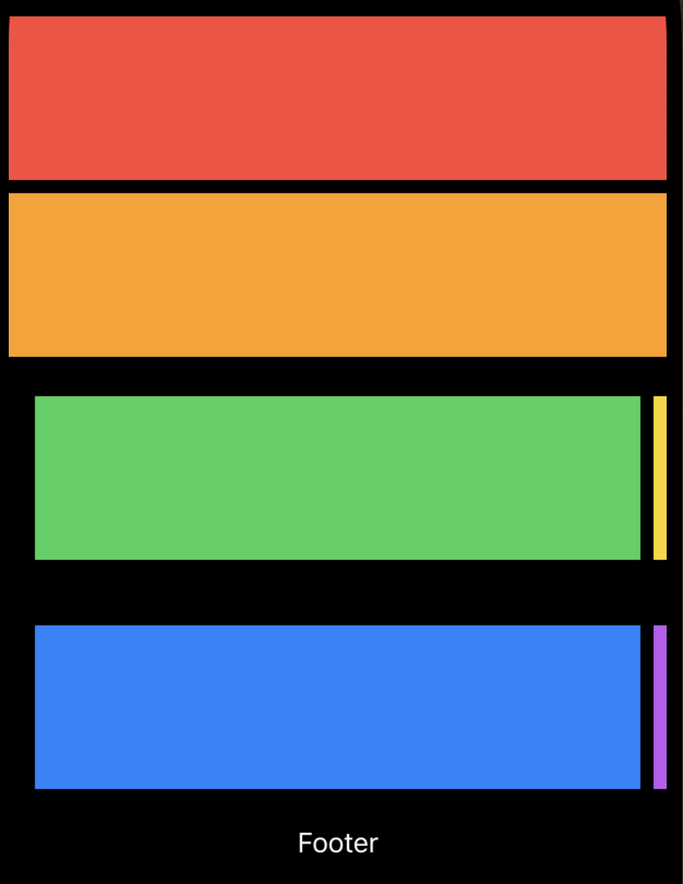
The SectionCollection type conforms to the RandomAccessCollection protocol, where the elements are instances of the SectionConfiguration type. So you can easily access the content, header, and footer of every section.
Today, we discovered advanced use cases of the new recomposition APIs introduced in SwiftUI. We learned how to extract the sections and recompose them using custom logic. I hope you enjoy the post. Feel free to follow me on Twitter and ask your questions related to this post. Thanks for reading, and see you next week!
]]>