Building BarChart with Shape API in SwiftUI
This week I want to show you how to use Shape API in SwiftUI. We will take a look at ready to use shapes like Circle, Capsule, Rectangle, etc. We will learn how to draw super custom shapes by using Path and GeometryReader. In the end, we will build BarChart implementation ultimately in SwiftUI.
Compare designs, show rulers, add a grid, quick actions for recent builds. Create recordings with touches & audio, trim and export them into MP4 or GIF and share them anywhere using drag & drop. Add bezels to screenshots and videos. Try now
Shape protocol
SwiftUI provides Shape protocol which has a single requirement path function. We use path function to describe our shape inside a provided rectangle. Let’s try to use it to draw a progress ring.
struct ProgressShape: Shape {
    let progress: Double

    func path(in rect: CGRect) -> Path {
        var path = Path()
        path.addArc(
            center: CGPoint(x: rect.midX, y: rect.midY),
            radius: rect.width / 2,
            startAngle: .radians(1.5 * .pi),
            endAngle: .init(radians: 2 * Double.pi * progress + 1.5 * Double.pi),
            clockwise: false
        )
        return path
    }
}
Here we use a little math to calculate arc which describes our progress. Shape protocol conforms to View protocol that’s why we can easily use it inside Stack or Group. We can also customize default drawing by setting custom StrokeStyle.
struct ProgressView: View {
    let progress: Double

    var body: some View {
        ProgressShape(progress: progress)
            .stroke(Color.blue,
                    style: StrokeStyle(
                        lineWidth: 4,
                        lineCap: .round,
                        lineJoin: .round,
                        miterLimit: 0,
                        dash: [],
                        dashPhase: 0
                    )
        )
    }
}
Ready to use shapes
We discussed how to draw custom shapes, but most of the time, it is enough to apply ready to use shapes provided by SwiftUI. SwiftUI offers shapes like Circle, Capsule, Rectangle, etc. We can easily use them to build BarChart in SwiftUI. Let’s start by describing the Bar data model.
struct Legend: Hashable {
    let color: Color
    let label: String
}

struct Bar: Identifiable {
    let id: UUID
    let value: Double
    let label: String
    let legend: Legend
}
As you can see, our Bar struct conforms to Identifiable protocol. We need Identifiable conformance to use Bar struct inside ForEach. ForEach uses Identifiable to understand data changes during the rendering process. Now we can draw our bars by using shape Capsule.
struct BarsView: View {
    let bars: [Bar]
    let max: Double

    init(bars: [Bar]) {
        self.bars = bars
        self.max = bars.map { $0.value }.max() ?? 0
    }

    var body: some View {
        GeometryReader { geometry in
            HStack(alignment: .bottom, spacing: 0) {
                ForEach(self.bars) { bar in
                    Capsule()
                        .fill(bar.legend.color)
                        .frame(height: CGFloat(bar.value) / CGFloat(self.max) * geometry.size.height)
                        .overlay(Rectangle().stroke(Color.white))
                        .accessibility(label: Text(bar.label))
                        .accessibility(value: Text(bar.legend.label))
                }
            }
        }
    }
}
Here we implement BarsView which uses HStack to display capsules in the horizontal layout. Another interesting fact here is GeometryReader. By wrapping any view inside the GeometryReader, we can access the geometry data like parent size and safe area insets provided by its container. We use container size to calculate the height of bars and draw them properly. We also use accessibility modifier here to make our bars more accessible and navigable.
Every chart should have a legend view. Let’s implement it by using another regular shape provided by SwiftUI. I want to display legends as a view which contains a small colored circle on the left and title on the right.
struct LegendView: View {
    private let legends: [Legend]

    init(bars: [Bar]) {
        legends = Array(Set(bars.map { $0.legend }))
    }

    var body: some View {
        HStack(alignment: .center) {
            ForEach(legends, id: \.self) { legend in
                VStack(alignment: .center) {
                    Circle()
                        .fill(legend.color)
                        .frame(width: 16, height: 16)

                    Text(legend.label)
                        .font(.subheadline)
                        .lineLimit(nil)
                }
            }
        }
    }
}
In the example above, we use Сircle shape to draw color indicators of every Legend. Now we can compose our BarsView and LegendsView to provide BarChart experience.
struct BarChartView: View {
    let bars: [Bar]

    var body: some View {
        Group {
            if bars.isEmpty {
                Text("There is no data to display chart...")
            } else {
                VStack {
                    BarsView(bars: bars)
                    LegendView(bars: bars)
                        .padding()
                        .accessibility(hidden: true)
                }
            }
        }
    }
}
Here we have BarChartView which puts BarsView and LegendsView inside the VStack. We also use accessibility modifier to hide LegendsView in the Accessibility tree.
Real-life example
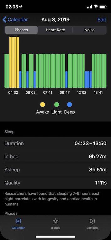
I use the source code from this post to implement BarChart in my SleepBot app. Besides the implementation which we have in the current post, I’ve added LabelsView. LabelsView presents the BarChart labels below the chart itself. Here is the implementation of that view.
struct LabelsView: View {
    let bars: [Bar]
    let labelsCount: Int

    private var threshold: Int {
        let threshold = bars.count / labelsCount
        return threshold == 0 ? 1 : threshold
    }

    var body: some View {
        HStack {
            ForEach(0..<bars.count, id: \.self) { index in
                Group {
                    if index % self.threshold == 0 {
                        Spacer()
                        Text(self.bars[index].label)
                            .font(.caption)
                        Spacer()
                    }
                }
            }
        }
    }
}
Take a look at the final version of BarChartView in SleepBot app.

Conclusion
Today we talked about Shape API which we have in SwiftUI. We also build BarChart experience by using ready to use Capsule and Circle shapes. We made our chart accessible by providing labels and values for our bars. Feel free to follow me on Twitter and ask your questions related to this post. Thanks for reading and see you next week!