Customizing Toggle in SwiftUI
This week we will continue mastering SwiftUI components by learning Toggle. Toggle is a view that we can use to allow users to toggle any boolean state in the app. SwiftUI enables us to customize toggles in a very convenient way by providing ToggleStyle protocol.
Compare designs, show rulers, add a grid, quick actions for recent builds. Create recordings with touches & audio, trim and export them into MP4 or GIF and share them anywhere using drag & drop. Add bezels to screenshots and videos. Try now
Basics
Let’s start with the basics of the Toggle component. To use Toggle, we need to create it by providing a binding to a boolean value that it is going to toggle and a label view that can be any combination of views. Let’s take a look at the very quick example of using a toggle.
struct ContentView: View {
    @State private var status = true

    var body: some View {
        Toggle(isOn: $status) {
            Text("toggle")
        }
    }
}
Binding is a property wrapper that allows us to access value types in a reference like manner. To learn more about binding and other property wrappers provided by SwiftUI, take a look at my “Understanding Property Wrappers in SwiftUI” post.
By default, SwiftUI uses the UISwitch view from UIKit to represent a Toggle. There is no way to change the tint color of Toggle from SwiftUI, but we can use UIAppearance API from UIKit to set the tint color for all UISwitch instances across the app. You can paste this line in AppDelegate to configure the color before you create a view.
UISwitch.appearance().onTintColor = .orange
Another thing which I want to mention is that you can easily hide the label of your Toggle by using a labelsHidden modifier.
struct ContentView: View {
    @State private var status = true

    var body: some View {
        Toggle(isOn: $status) {
            Text("toggle")
        }.labelsHidden()
    }
}
Toggle collection
The SwiftUI framework allows us to create a Toggle that binds to a collection of values. In the example below, we define a Toggle that uses keypath to boolean on the array of tasks.
struct Task: Identifiable {
    let id = UUID()
    var done = false
    var title = ""
}

struct ContentView: View {
    @State private var tasks: [Task] = [
        .init(title: "Task 1"),
        .init(title: "Task 2"),
    ]

    var body: some View {
        List {
            ForEach($tasks, id: \.id) { $task in
                Toggle(isOn: $task.done) {
                    Text(verbatim: task.title)
                }
            }

            Toggle(sources: $tasks, isOn: \.done) {
                Text("Mark all")
            }
        }
    }
}
Styling
We learned how to change the tint color of Toggle, but what about real styling options. For example, you might want to replace the UISwitch presentation of toggles with a checkbox. SwiftUI provides a ToggleStyle protocol that allows us to customize toggles in a way we can imagine.
@available(iOS 13.0, OSX 10.15, tvOS 13.0, watchOS 6.0, *)
public protocol ToggleStyle {
    associatedtype Body : View

    func makeBody(configuration: Self.Configuration) -> Self.Body

    typealias Configuration = ToggleStyleConfiguration
}
It is so awesome that SwiftUI allows us to style views in a consistent way. SwiftUI also provides ButtonStyle protocol that we can use to design buttons. To learn more, take a look at my “Mastering buttons in SwiftUI” post.
The only requirement of ToggleStyle protocol is makeBody function that should return some view. makeBody function has a single parameter that we can use to access a user-defined label to place it according to our design and binding that we can toggle when the user alters the state. Let’s create our very first Toggle style that will render it as a checkbox.
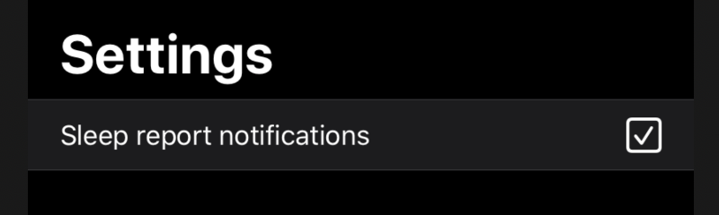
struct CheckboxToggleStyle: ToggleStyle {
    func makeBody(configuration: Configuration) -> some View {
        return HStack {
            configuration.label
            Spacer()
            Image(systemName: configuration.isOn ? "checkmark.square" : "square")
                .resizable()
                .frame(width: 22, height: 22)
                .onTapGesture { configuration.isOn.toggle() }
        }
    }
}
As you can see in the example above, we create a CheckboxToggleStyle struct that conforms ToggleStyle protocol. We place a user-defined label in an HStack with the Image that uses SF Symbols to display checkmark in a square whenever binding is true or an empty square when binding is false.
We can easily apply our CheckboxToggleStyle to every Toggle in our app by using the toggleStyle modifier. It uses the environment feature of SwiftUI to share the style with all views in the current environment. But remember that you can easily use this modifier on the concrete Toggle instance also.
struct ContentView: View {
    @State private var status = true

    var body: some View {
        Toggle(isOn: $status) {
            Text("toggle")
        }.toggleStyle(CheckboxToggleStyle())
    }
}
SwiftUI uses environment to pass system-wide and application-related information. You can also populate environment with your custom objects. To learn more about environment, take a look at my “The power of Environment in SwiftUI” post.
Conclusion
Today we learned about another vital SwiftUI component. I’m delighted that SwiftUI provides a very consistent way of styling views. I hope you enjoy the post. Feel free to follow me on Twitter and ask your questions related to this post. Thanks for reading, and see you next week!