Mastering grids in SwiftUI
This week I want to talk about grids in SwiftUI. It was the most expected feature. Everybody has been waiting for UICollectionView alternative in SwiftUI, and finally, it arrived this year. SwiftUI provides us LazyVGrid and LazyHGrid views that we can use to build grid-based layouts.
Compare designs, show rulers, add a grid, quick actions for recent builds. Create recordings with touches & audio, trim and export them into MP4 or GIF and share them anywhere using drag & drop. Add bezels to screenshots and videos. Try now
Basics
LazyVGrid and LazyHGrid are two new view types that SwiftUI gives us to build a super custom grid-based layout. The only difference between them is the layout axis. LazyVGrid populates the available space in the vertical direction. On the other hand, LazyHGrid arranges its children in the horizontal direction. Axis is the only difference between these two views. That’s why everything that you see about LazyVGrid applies to LazyHGrid and vice versa. Let’s take a look at our first example.
struct ContentView: View {
private var columns: [GridItem] = [
GridItem(.fixed(100), spacing: 16),
GridItem(.fixed(100), spacing: 16),
GridItem(.fixed(100), spacing: 16)
]
var body: some View {
ScrollView {
LazyVGrid(
columns: columns,
alignment: .center,
spacing: 16,
pinnedViews: [.sectionHeaders, .sectionFooters]
) {
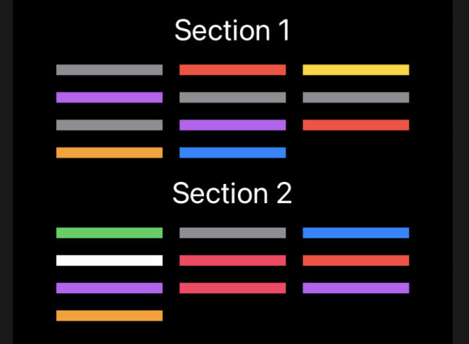
Section(header: Text("Section 1").font(.title)) {
ForEach(0...10, id: \.self) { index in
Color.random
}
}
Section(header: Text("Section 2").font(.title)) {
ForEach(11...20, id: \.self) { index in
Color.random
}
}
}
}
}
}
In the example above, we create a three-column grid where every column has a fixed size of 100pt. I’m going to use this example to describe every configuration option that we have.
- columns parameter is the array that defines columns in a grid layout. SwiftUI provides us GridItem type to describe a column. We will talk about it later in the post.
- alignment parameter allows us to align the grid’s content using HorizontalAlignment enum for LazyVGrid and VerticalAlignment for LazyHGrid. It works the same way as the stack alignment.
- spacing parameter specifies the space between every row inside the LazyVGrid or space between every column inside the LazyHGrid.
- pinnedViews parameter specifies the pinning options for section headers and footers. By default, it is empty, which means that section headers and footers behave as content and go away while scrolling. You can enable header and footer pinning, in this case, headers and footers overlay the content and become сonstantly visible.
GridItem
Every column in a grid has to be defined using GridItem struct. GridItem type allows us to specify size, alignment, and spacing for every column. Let’s take a look at a small example.
private var columns: [GridItem] = [
    GridItem(.fixed(50), spacing: 16, alignment: .leading),
    GridItem(.fixed(75)),
    GridItem(.fixed(100))
]

As you can see, every column can have different sizing, spacing, and alignment options. The most interesting here is sizing. There are three ways to define the size of a column inside a grid. It can be fixed or flexible or adaptive.
The fixed column is the easiest one. Grid setup the column to match the size that you define. In the previous example, we created a three-column layout where columns have fixed sizes 50pt, 75pt, and 100pt accordingly.
The flexible option allows us to define a column that expands or shrinks depending on available space. We can also provide a minimum and maximum size for the flexible column. By default, it uses 10pt as minimal value and infinity as maximal.
private var columns: [GridItem] = [
    GridItem(.flexible(minimum: 250)),
    GridItem(.flexible())
]

Here we create a layout that divides available space between two flexible columns. The first column requires 250pt to be a minimum size, where the second one consumes all the available space.
The most exciting option is adaptive. The adaptive option allows us to place multiple items in the space of a single flexible column. Let’s take a look at the example to understand it better.
private var columns: [GridItem] = [
    GridItem(.adaptive(minimum: 50, maximum: 100)),
    GridItem(.adaptive(minimum: 150))
]

As you can see, we have two adaptive columns. There are multiple items inside the first adaptive column with a minimal size of 50pt and maximal 100pt. Adaptive columns are handy when the count of items inside the column should depend on available space.
The real power of grids appears when you start mixing multiple column types. You can create a layout of two columns, where the first one is fixed, and the second is adaptive. Let’s take a look at this example.
private var columns: [GridItem] = [
    GridItem(.fixed(100)),
    GridItem(.adaptive(minimum: 50))
]

Conclusion
Grids allow us to create very complex and great layouts by mixing different types of GridItems. Remember that all the changes in grids are animatable. I hope you enjoy the post. Feel free to follow me on Twitter and ask your questions related to this post. Thanks for reading, and see you next week!