Menus in SwiftUI
This week we got another Xcode Beta that brings menus into SwiftUI world. Menus are going to replace old action sheets that have been here since iOS 8. Action sheets don’t play well with huge screens that we have nowadays. This week we will learn how to use menus to provide secondary actions or selection options in SwiftUI.
Compare designs, show rulers, add a grid, quick actions for recent builds. Create recordings with touches & audio, trim and export them into MP4 or GIF and share them anywhere using drag & drop. Add bezels to screenshots and videos. Try now
Appearance is the main problem of action sheets. An action sheet appears at the bottom of the screen and sometimes loses the context of the action. For example, you may press the button in the navigation bar that reveals the action sheet at the bottom of the screen. Another problem with action sheets is the space that it needs to display the action list. Action sheets cover the big part of the screen, even with a small set of options.
To learn more about action sheets, take a look at my “Alerts, Action Sheets, Modals and Popovers in SwiftUI” post.
Disambiguation
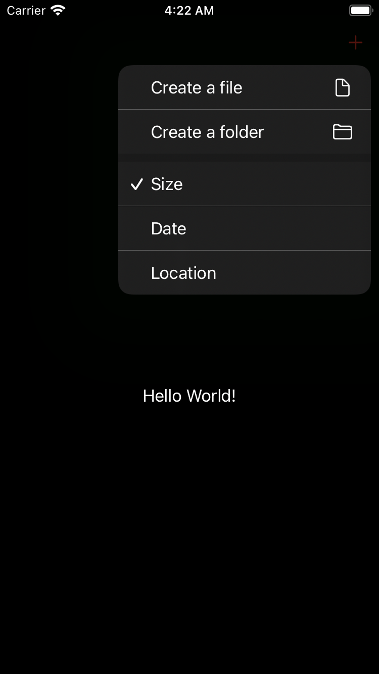
The main reason to use brand new menus is disambiguation. It allows us to provide additional context around your primary action. Assume that we are working on a file manager app where the main action is creating new files or folders. We have a button with the plus sign in the navigation bar to describe the primary action. It might not be evident for the user what we will do here, creating a new file or a folder? And this is a perfect use case for a menu to solve the disambiguation. Let’s see how we can use it.
import SwiftUI

struct ContentView: View {
    var body: some View {
        Text("Hello World!")
            .toolbar {
                ToolbarItem(placement: .primaryAction) {
                    Menu {
                        Button(action: {}) {
                            Label("Create a file", systemImage: "doc")
                        }

                        Button(action: {}) {
                            Label("Create a folder", systemImage: "folder")
                        }
                    }
                    label: {
                        Label("Add", systemImage: "plus")
                    }
                }
            }
    }
}
To learn more about the power of toolbars in SwiftUI, take a look at my “Mastering toolbars in SwiftUI” post.
Selection
Another excellent use case for a menu might be a selection option. Assume that you need to provide sorting options in the context of our file manager app. Multiple selection options fit great into the menu world. You can use the SwiftUI Picker view to provide various options in a menu. The declarative nature of the SwiftUI framework allows the picker to adopt the menu and display it inline. Let’s take a look at the quick example.
import SwiftUI

struct ContentView: View {
    @State private var sort: Int = 0

    var body: some View {
        Text("Hello World!")
            .toolbar {
                ToolbarItem(placement: .primaryAction) {
                    Menu {
                        Picker(selection: $sort, label: Text("Sorting options")) {
                            Text("Size").tag(0)
                            Text("Date").tag(1)
                            Text("Location").tag(2)
                        }
                    }
                    label: {
                        Label("Sort", systemImage: "arrow.up.arrow.down")
                    }
                }
            }
    }
}
Primary action
SwiftUI allows us to set a primary action on menu which is available via default gesture like press on iOS or mouse click on macOS. Menu content is available via secondary gesture which is long press on iOS. Menu indicator provides you access to secondary actions on macOS.
struct ContentView: View {
    var body: some View {
        Menu {
            Button("Add reference") {
                print("Add reference")
            }
            Button("Add folder") {
                print("Add folder")
            }
        } label: {
            Label("Add", systemImage: "plus")
        } primaryAction: {
            print("Add file")
        }
    }
}
Secondary actions
Menu is a great way to provide a bunch of secondary actions on a view in your app. You can easily group and present actions in your menu by using sections and dividers.
import SwiftUI

struct ContentView: View {
    var body: some View {
        Text("Hello World!")
            .toolbar {
                ToolbarItem(placement: .primaryAction) {
                    Menu {
                        Section {
                            Button(action: {}) {
                                Label("Create a file", systemImage: "doc")
                            }

                            Button(action: {}) {
                                Label("Create a folder", systemImage: "folder")
                            }
                        }

                        Section(header: Text("Secondary actions")) {
                            Button(action: {}) {
                                Label("Remove old files", systemImage: "trash")
                                    .foregroundColor(.red)
                            }
                        }
                    }
                    label: {
                        Label("Add", systemImage: "plus")
                    }
                }
            }
    }
}
Styling
SwiftUI doesn’t provide us too many customization options on a menu. But still, it gives us the MenuStyle protocol that we can use to create our appearances. It works similarly to all style protocols that we have in SwiftUI. We can set it via the environment to share the styling with the view hierarchy.
import SwiftUI

struct RedMenu: MenuStyle {
    func makeBody(configuration: Configuration) -> some View {
        Menu(configuration)
            .foregroundColor(.red)
    }
}

struct ContentView: View {
    var body: some View {
        Text("Hello World!")
            .toolbar {
                ToolbarItem(placement: .primaryAction) {
                    Menu("Add") {
                        Button("File") {}
                        Button("Folder") {}
                    }.menuStyle(RedMenu())
                }
            }
    }
}
Conclusion
As you can see, there are tons of possible use cases for menus. Menus will play a significant role in a new design language that Apple prepares for us. I hope you enjoy the post. Feel free to follow me on Twitter and ask your questions related to this article. Thanks for reading, and see you next week!