Styling custom SwiftUI views using environment
One of my favorite features of SwiftUI is styling. I love the idea of style protocols provided by every view and sharing them using the environment. I have already covered most of the style protocols for SwiftUI provided views in my previous posts. But what about custom views? This week we will learn how to share styling using environment for our custom views.
Compare designs, show rulers, add a grid, quick actions for recent builds. Create recordings with touches & audio, trim and export them into MP4 or GIF and share them anywhere using drag & drop. Add bezels to screenshots and videos. Try now
Basics
If you are not familiar with style protocols in SwiftUI, let me show you a rapid example of using them.
struct MyApp: App {
    var body: some Scene {
        WindowGroup {
            RootView()
                .listStyle(InsetGroupedListStyle())
        }
    }
}
In the example above, we attached the listStyle modifier to the root view of the app. This modifier shares the instance of ListStyle protocol with the whole app view hierarchy using the environment. All the app list instances will use InsetGroupedListStyle by default just because of this single line of code. But don’t worry. Any particular part of the view hierarchy can override this value with any other style when needed. Let’s take a look at another example.
struct FillButtonStyle: ButtonStyle {
    func makeBody(configuration: Configuration) -> some View {
        configuration.label
            .padding()
            .foregroundColor(.white)
            .background(Color.accentColor)
            .clipShape(RoundedRectangle(cornerRadius: 8, style: .continuous))
    }
}

struct MyApp: App {
    var body: some Scene {
        WindowGroup {
            RootView()
                .buttonStyle(FillButtonStyle())
                .listStyle(InsetGroupedListStyle())
        }
    }
}
As you can see here, we apply the unified button style for all the buttons in the app. All buttons will be filled with the accent color and will use the rounded rectangle’s shape.
To learn more about ButtonStyle protocol, look at my “Mastering buttons in SwiftUI” post.
Styling using view parameters
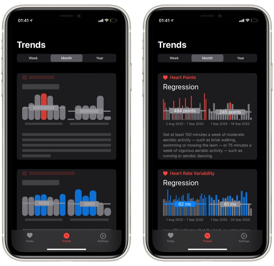
Now we know how to use the style protocols that SwiftUI provides us, but what about our custom views? I maintain a small charting library. As you may know, charts can be highly flexible in terms of configuration. Let’s take a look at the usage example of my charting library.
let dataPoints: [DataPoint] = []

BarChartView(
    dataPoints: dataPoints,
    showLabels: true,
    labelCount: 3,
    showLegends: true
)
As you can see, multiple parameters allow us to configure the chart presentation. There are actually many more parameters, but all of them have default values, and you don’t need to provide them here.
The first thing that I decide to do is extract the chart presentation parameters into a separated struct to keep them apart from chart data.
public struct ChartStyle {
    let barMinHeight: CGFloat
    let showAxis: Bool
    let axisLeadingPadding: CGFloat
    let showLabels: Bool
    let labelCount: Int?
    let showLegends: Bool

    public init(
        barMinHeight: CGFloat = 100,
        showAxis: Bool = true,
        axisLeadingPadding: CGFloat = 0,
        showLabels: Bool = true,
        labelCount: Int? = nil,
        showLegends: Bool = true
    ) {
        self.barMinHeight = barMinHeight
        self.showAxis = showAxis
        self.axisLeadingPadding = axisLeadingPadding
        self.showLabels = showLabels
        self.labelCount = labelCount
        self.showLegends = showLegends
    }
}
Let’s take a look at the usage example now.
let dataPoints: [DataPoint] = []
let style = ChartStyle(showAxis: false, labelCount: 3)
BarChartView(dataPoints: dataPoints, style: style)
Styling using environment
The previous example looks better than before, but it doesn’t give us all the benefits of environment sharing that standard SwiftUI views have. We can easily solve it by inserting an instance of style struct into the environment instead of passing it via initializer. Let’s take a look at how we can do that.
struct ChartStyleEnvironmentKey: EnvironmentKey {
    static var defaultValue: ChartStyle = .init()
}

extension EnvironmentValues {
    var chartStyle: ChartStyle {
        get { self[ChartStyleEnvironmentKey.self] }
        set { self[ChartStyleEnvironmentKey.self] = newValue }
    }
}

extension View {
    func chartStyle(_ style: ChartStyle) -> some View {
        environment(\.chartStyle, style)
    }
}
First of all, we create an additional environment value that will hold the chart style. Then we create an extension on View protocol that allows us to insert chart styles into a view hierarchy environment.
To learn more about the possibilities of SwiftUI’s environment feature, take a look at my “The power of Environment in SwiftUI” post.
We can use the environment property wrapper inside BarChartView to obtain the style that the environment shares.
public struct BarChartView: View {
    @Environment(\.chartStyle) var chartStyle
    let dataPoints: [DataPoint]

    var body: some View {
        // draw bars
        if chartStyle.showLabels {
            // show labels
        }

        if chartStyle.showLegends {
            // show legend
        }
    }
}

let dataPoints1: [DataPoint] = // ...
let dataPoints2: [DataPoint] = // ...

HStack {
    BarChartView(dataPoints: dataPoints1)
    BarChartView(dataPoints: dataPoints2)
}.chartStyle(ChartStyle(showAxis: false, labelCount: 3))

Conclusion
I really love this approach because it easily allows us to style the whole app hierarchy. For example, I have a screen that displays a list of charts with different data points. All of these charts have the same styling, which I insert into the environment of its parent view using a single line of code.
I hope you enjoy the post. Feel free to follow me on Twitter and ask your questions related to this article. Thanks for reading, and see you next week!