Mastering ControlGroup in SwiftUI
One of the new container views delivered in SwiftUI Release 3 was the ControlGroup view. The ControlGroup view displays semantically-related controls in a visually appropriate manner for the context. This week we will learn how to use and customize the appearance of the ControlGroup view in SwiftUI.
Basics
The ControlGroup view is the simple container view that accepts ViewBuilder closure and displays it depending on the current environment. Let’s see how we can use it.
To learn more about ViewBuilder, take a look at my dedicated “The power of @ViewBuilder in SwiftUI” post.
struct ContentView: View {
    var body: some View {
        ControlGroup {
            Button(action: {}) {
                Label("Decrease", systemImage: "minus")
            }

            Button(action: {}) {
                Label("Increase", systemImage: "plus")
            }
        }
    }
}
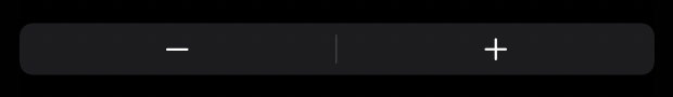
As you can see in the example above, we simply put two buttons inside the ControlGroup view as we do with VStack or HStack. But instead of laying out views using vertical or horizontal axes, the ControlGroup adds the semantic look and feel depending on the view’s placement.
Styling
The ControlGroup view has a few styling options out of the box. SwiftUI provides automatic and navigation styles. The automatic style is used by default, but you can set another style directly using the controlGroupStyle view modifier. SwiftUI uses the navigation style when you place the ControlGroup view in the toolbar of the NavigationView.
struct ContentView: View {
    var body: some View {
        ControlGroup {
            Button(action: {}) {
                Label("Decrease", systemImage: "minus")
            }

            Button(action: {}) {
                Label("Increase", systemImage: "plus")
            }
        }
        .controlGroupStyle(.navigation)
    }
}

As you can see in the example, we use the controlGroupStyle view modifier to set the style manually. SwiftUI uses the same approach for many different views and allows us to create our own style types by conforming to a protocol. In the case of the ControlGroup view, we should create a type that conforms to the ControlGroupStyle protocol and implement the single required function called makeBody.
To learn more about other styling protocols available in SwiftUI, take a look at “Mastering buttons in SwiftUI” post.
struct VerticalControlGroupStyle: ControlGroupStyle {
    func makeBody(configuration: Configuration) -> some View {
        VStack {
            configuration.content
        }.foregroundColor(.red)
    }
}

struct ContentView: View {
    var body: some View {
        ControlGroup {
            Button("Action 1") {}
            Button("Action 2") {}
        }
        .controlGroupStyle(VerticalControlGroupStyle())
    }
}

The makeBody function has the single parameter of Configuration type that you can use to access the content of the ControlGroup passed via ViewBuilder closure. It allows you to modify the look and feel of the content in the way you need by applying any view modifiers you want. In the current example, we place the content in the vertical stack and set the foreground color to red.
struct ControlGroupWithTitle: ControlGroupStyle {
    let title: LocalizedStringKey

    func makeBody(configuration: Configuration) -> some View {
        VStack {
            Text(title)
                .font(.title)
            HStack {
                configuration.content
            }
        }
    }
}

struct ContentView: View {
    var body: some View {
        ControlGroup {
            Button("Action 1") {}
            Button("Action 2") {}
        }
        .controlGroupStyle(ControlGroupWithTitle(title: "Actions"))
    }
}

We also can change the look and feel by adding new views and wrapping the content with another container view.
extension ControlGroupStyle where Self == ControlGroupWithTitle {
    static func with(title: LocalizedStringKey) -> ControlGroupWithTitle {
        ControlGroupWithTitle(title: title)
    }
}

struct ContentView: View {
    var body: some View {
        ControlGroup {
            Button("Action 1") {}
            Button("Action 2") {}
        }.controlGroupStyle(.with(title: "Actions"))
    }
}
Swift 5.5 allows us to write extensions for protocols with associated types and improve the usage of our custom styles provided to the controlGroupStyle view modifier.
Conclusion
The ControlGroup view is a new way to group buttons and other controls in a semantic way. I really love SwiftUI because it uses the same approach across the many views to provide custom styling options. I hope you enjoy the post. Feel free to follow me on Twitter and ask your questions related to this post. Thanks for reading, and see you next week!