Mastering LabeledContent in SwiftUI
One of the new SwiftUI views released during WWDC22 was LabeledContent. And it became one of my favorite views that I try to use everywhere because it fits very well into Human Design Guidelines. This week we will learn how to use LabeledContent to provide a platform-oriented experience.
LabeledContent view is a simple view that composes a label and content. Usually, it displays the label on the leading edge and the content on the trailing edge. You can achieve similar behavior by inserting the label and content into the HStack and placing the Spacer view between them.
But LabeledContent is not that simple. It understands its parent container and can display the content in different ways. LabeledContent can also apply additional styling like using secondary color as foreground color for its content. Let’s take a look at how we can use it.
struct ContentView: View {
var body: some View {
Form {
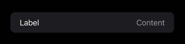
LabeledContent("Label", value: "Content")
}
}
}
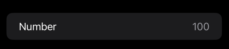
As you can see in the example above, the usage of the LabeledContent view is straightforward. But it works not only for String values. You can use it to present any data supporting the FormatStyle protocol.
struct ContentView: View {
    var body: some View {
        Form {
            LabeledContent(
                "Number",
                value: 100.0,
                format: .number.precision(.fractionLength(0))
            )
        }
    }
}
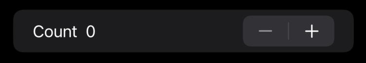
The LabeledContent view allows you to present any SwiftUI view as a label or content. For example, you might use it to display a Stepper inside the Form.
struct ContentView: View {
    @State private var value = 0.0

    var body: some View {
        Form {
            LabeledContent {
                Stepper(value: $value, in: 0...10.0) {
                    Text(value.formatted(.number))
                }
            } label: {
                Text("Count")
            }
        }
    }
}
Styling
Like many SwiftUI views, the LabeledContent view supports styling via the particular LabeledContentStyle protocol. You only need to create a type conforming to LabeledContentStyle protocol and implement your makeBody function.
struct AccentedLabeledContentStyle: LabeledContentStyle {
    func makeBody(configuration: Configuration) -> some View {
        LabeledContent(configuration)
            .foregroundColor(.accentColor)
    }
}

extension LabeledContentStyle where Self == AccentedLabeledContentStyle {
    static var accented: AccentedLabeledContentStyle { .init() }
}

struct ContentView: View {
    var body: some View {
        Form {
            LabeledContent("Label", value: "Content")
                .labeledContentStyle(.accented)
        }
    }
}
As you can see in the example above, we create another instance of the LabeledContent view and pass the instance of the Configuration type that holds the label and content views. It works great when you want to apply custom styling options. But sometimes we need to provide a completely different layout with our custom styling. We can achieve it by implementing the makeBody function without using LabeledContent.
struct VerticalLabeledContentStyle: LabeledContentStyle {
    func makeBody(configuration: Configuration) -> some View {
        VStack(alignment: .leading) {
            configuration.label
            configuration.content
        }
    }
}

extension LabeledContentStyle where Self == VerticalLabeledContentStyle {
    static var vertical: VerticalLabeledContentStyle { .init() }
}


struct ContentView: View {
    var body: some View {
        Form {
            LabeledContent("Label", value: "Content")
                .labeledContentStyle(.vertical)
        }
    }
}
Using the labeledContentStyle view modifier, we put our custom style into the environment where all the child views of the view hierarchy use this style unless it is overridden. You can also hide the label of the LabeledContent view by attaching the labelsHidden view modifier.
struct ContentView: View {
    var body: some View {
        Form {
            LabeledContent("Label", value: "Content")
                .labelsHidden()
        }
    }
}
To learn more about sharing styles using the environment, take a look at my “Styling custom SwiftUI views using environment” post.
Conclusion
Today we learned about another great view that SwiftUI provides to simplify our lives. To be honest, I have a similar view in my codebase that doing the same, but it is always great to have this kind of thing provided by the SDK. I hope you enjoy the post. Feel free to follow me on Twitter and ask your questions related to this post. Thanks for reading, and see you next week!