Mastering charts in SwiftUI. Basics.
Swift Charts is a new framework by Apple allowing us to visualize our data in a declarative way using SwiftUI. The Swift Charts framework inherits from SwiftUI its declarative nature and the power of intelligent defaults. This week we will start with the basics of the Charts framework.
Let’s start by plotting a simple line chart from an array of numbers.
struct ContentView: View {
    let numbers: [Double]

    var body: some View {
        Chart {
            ForEach(Array(numbers.enumerated()), id: \.offset) { index, value in
                LineMark(
                    x: .value("Index", index),
                    y: .value("Value", value)
                )
            }
        }
    }
}
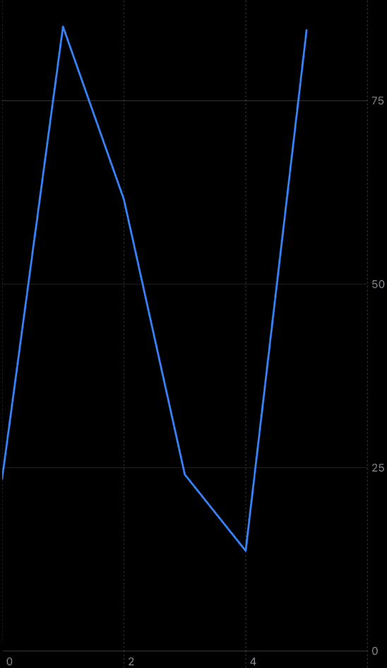
As you can see in the example above, we define an instance of the Chart view. Then inside the ViewBuilder closure of the Chart view, we use the ForEach view to place the array of numbers using the LineMark. The Chart view is smart enough to plot the single line passing all the points defined via LineMark.
To learn more about the logic behind the ViewBuilder type, take a look at my “The power of @ViewBuilder in SwiftUI” post.
Swift Charts allow us to compose different types of marks on a single chart. We have plenty of marks in use, like AreaMark, BarMark, LineMark, PointMark, RectangleMark, and RuleMark.
struct ContentView: View {
    let numbers: [Double]

    var body: some View {
        Chart {
            RuleMark(y: .value("Limit", 50))

            ForEach(Array(numbers.enumerated()), id: \.offset) { index, value in
                LineMark(
                    x: .value("Index", index),
                    y: .value("Value", value)
                )

                PointMark(
                    x: .value("Index", index),
                    y: .value("Value", value)
                )
            }
        }
    }
}

In the example above, we use the PointMark type to draw a circular point for every data point. We also use RuleMark to draw a horizontal limit line. As you can see, we easily compose different marks on the same chart.
The heart of the Swift Charts framework is the Plottable protocol. It allows us to define a mark with any value that conforms to the Plottable protocol. By default, types like Int, String, Double, Date, and Decimal conform to the Plottable protocol. But you can always conform your own type to the Plottable protocol if needed.
Swift Charts support quantitative, categorical, and temporal values. For example, Double is quantitative, String is categorical, and Date is temporal value.
enum Gender: String {
    case male
    case female
    case notSet
}

struct Stats {
    let city: String
    let population: Int
    let gender: Gender
}
Here we create a type called Stats to define a city’s population by gender. The city’s population is a quantitative value. The name and gender are categorical.
struct ContentView1: View {
    let stats: [Stats]

    var body: some View {
        Chart {
            ForEach(stats, id: \.city) { stat in
                BarMark(
                    x: .value("City", stat.city),
                    y: .value("Population", stat.population)
                )
            }
        }
    }
}

struct ContentView_Previews: PreviewProvider {
    static var previews: some View {
        NavigationStack {
            ContentView1(
                stats: [
                    .init(city: "NY", population: 10_164_966, gender: .female),
                    .init(city: "NY", population: 9_581_261, gender: .male),
                    .init(city: "LA", population: 5_133_906, gender: .female),
                    .init(city: "LA", population: 4_982_799, gender: .male)
                ]
            )
            .preferredColorScheme(.dark)
        }
    }
}
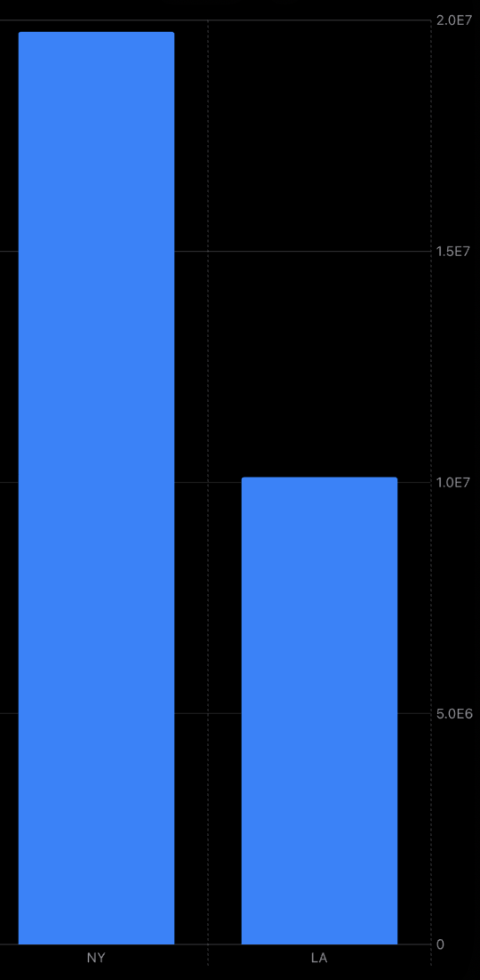
As you can see in the example above, we use the BarMark type to draw the population of the provided cities. We use the city name, which is categorical type as X position. That’s why the Chart view concatenate every mark with the same X position.
struct ContentView1: View {
    let stats: [Stats]

    var body: some View {
        Chart {
            ForEach(stats, id: \.city) { stat in
                BarMark(
                    x: .value("City", stat.city),
                    y: .value("Population", stat.population)
                )
                .foregroundStyle(by: .value("Gender", stat.gender.rawValue))
            }
        }
    }
}
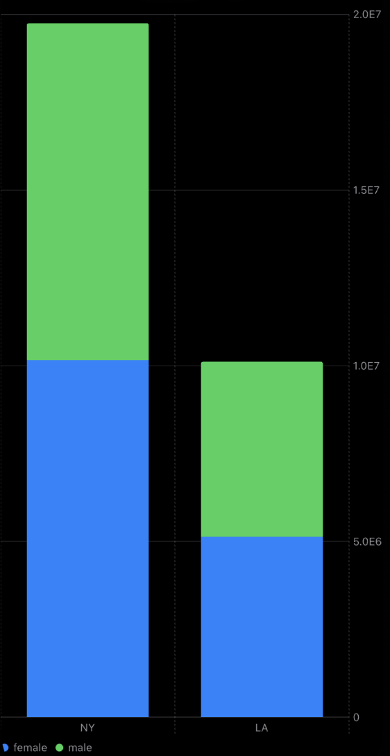
We can use different foreground styles for the BarMark type and style them using gender value. It allows us to see the different ranges in a single bar.
enum Gender: String {
    case male
    case female
    case notSet
}

extension Gender: Plottable {
    var primitivePlottable: String {
        rawValue
    }
}

struct Stats {
    let city: String
    let population: Int
    let gender: Gender
}

struct ContentView1: View {
    let stats: [Stats]

    var body: some View {
        Chart {
            ForEach(stats, id: \.city) { stat in
                BarMark(
                    x: .value("City", stat.city),
                    y: .value("Population", stat.population)
                )
                .foregroundStyle(by: .value("Gender", stat.gender))
            }
        }
    }
}
Now we conform the Gender type to the Plottable protocol to simplify our code a little bit. Remember that you can provide any logic you need to convert your custom data to plottable primitives.
Today we learned basics of the new Swift Charts framework. Charts framework provides us a lot of defaults out of the box. Every chart we build supports accessibility and automatically provides us legends, correctly scaled plotting area, etc.
In the next posts, we will learn more about customization options in the new Charts framework. I hope you enjoy the post. Feel free to follow me on Twitter and ask your questions related to this post. Thanks for reading, and see you next week!