Glassifying tabs in SwiftUI
One of the most important changes presented during WWDC 25 was the new design language used across all Apple platforms called Liquid Glass. Tabs play a significant role in the new design and provide new ways of interacting with them. This week, we will learn about new APIs that SwiftUI provides us to handle new tab interactions.
Compare designs, show rulers, add a grid, quick actions for recent builds. Create recordings with touches & audio, trim and export them into MP4 or GIF and share them anywhere using drag & drop. Add bezels to screenshots and videos. Try now
SwiftUI introduced a slightly new API for managing tabs earlier. This year, that API was adopted to the new Liquid Glass design. You still can use the previous API, but in that case, you can’t take advantage of all the new interactions. So, I suggest you migrate to the new Tab API if you support iOS 18 and later.
struct ContentView: View {
    var body: some View {
        TabView {
            Tab("feed", systemImage: "list.star") {
                // content
            }

            Tab("settings", systemImage: "gear") {
                // content
            }
        }
    }
}
As you can see in the example above, we still use the old TabView, but instead of placing tab content inside the TabView we wrap it with Tab type. We can also programmatically control the tab selection by using TabView with Tab in pair.
struct ContentView: View {
    @SceneStorage("selectedTab") private var selectedTabIndex = 0

    var body: some View {
        TabView(selection: $selectedTabIndex) {
            Tab("feed", systemImage: "list.star", value: 0) {
                // content
            }

            Tab("settings", systemImage: "gear", value: 1) {
                // content
            }
        }
    }
}
This way we can bind the tab selection to the selectedTabIndex which uses the SceneStorage property wrapper to rescue the selected tab while state restoration of the app.
struct ContentView: View {
@SceneStorage("selectedTab") private var selectedTabIndex = 0
var body: some View {
TabView(selection: $selectedTabIndex) {
Tab("feed", systemImage: "ruler", value: 0) {
// content
}
// Other tabs
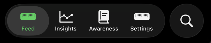
Tab("search", systemImage: "magnifyingglass", value: 1, role: .search) {
// content
}
Tab("settings", systemImage: "ruler", value: 2) {
// content
}
}
}
}
The Tab type also provides us the role parameter which we can use to set a specific role on the tab. At the moment, the only available instance of the TabRole type is the search. The search role allows the system to display search tab in a different way. For example, it is separated on iOS from all other tabs.
Most of my apps use tabs on iOS and watchOS while using sidebar navigation on macOS and iPadOS. SwiftUI simplifies this significantly by introducing the new sidebarAdaptable style. You don’t need to manually create the sidebar, it automatically replaces tabs with sidebar on iPadOS and macOS.
struct ContentView: View {
    @SceneStorage("selectedTab") private var selectedTabIndex = 0

    var body: some View {
        TabView(selection: $selectedTabIndex) {
            Tab("feed", systemImage: "list.star", value: 0) {
                // content
            }

            Tab("settings", systemImage: "gear", value: 2) {
                // content
            }
        }
        .tabViewStyle(.sidebarAdaptable)
    }
}
As you can see, all you need to do is use the tabViewStyle view modifier with the sidebarAdaptable value. Another interesting design concept that the Liquid Glass introduced is the tab accessory view. Tab accessory view is displayed on top of tabs and is always visible. It is approachable for global status or global action. For example, it indicates the current playing song in Apple Music apps and controls to pause or skip it.
struct ContentView: View {
    @SceneStorage("selectedTab") private var selectedTabIndex = 0

    var body: some View {
        TabView(selection: $selectedTabIndex) {
            Tab("feed", systemImage: "list.star", value: 0) {
                // content
            }

            Tab("settings", systemImage: "gear", value: 2) {
                // content
            }
        }
        .tabViewStyle(.sidebarAdaptable)
        .tabViewBottomAccessory {
            Button("Do Action") {

            }
        }
    }
}
SwiftUI provides the new tabViewBottomAccessory view modifier, allowing us to set up a tab accessory view. Another interesting interaction that Liquid Glass introduced is the tab minimization. So, you can minimize tabs and display only the current one while the user is scrolling the content. We can control the tab minimization behavior by using the new tabBarMinimizeBehavior view modifier.
struct ContentView: View {
    @SceneStorage("selectedTab") private var selectedTabIndex = 0

    var body: some View {
        TabView(selection: $selectedTabIndex) {
            Tab("feed", systemImage: "list.star", value: 0) {
                // content
            }

            Tab("settings", systemImage: "gear", value: 2) {
                // content
            }
        }
        .tabViewStyle(.sidebarAdaptable)
        .tabBarMinimizeBehavior(.onScrollDown)
        .tabViewBottomAccessory {
            Button("Do Action") {

            }
        }
    }
}
Today we learned how to adapt the new Liquid Glass design language to the tab navigation which is the most popular way of structuring mobile apps. I hope you enjoy the post. Feel free to follow me on Twitter and ask your questions related to this post. Thanks for reading, and see you next week!