Glassifying toolbars in SwiftUI
Liquid Glass is the new design language Apple using across all of its platforms. The look and feel of tabs was the major change that we covered last week. This week we will focus on another significant change related to toolbars.
Compare designs, show rulers, add a grid, quick actions for recent builds. Create recordings with touches & audio, trim and export them into MP4 or GIF and share them anywhere using drag & drop. Add bezels to screenshots and videos. Try now
Toolbars changed significantly in Liquid Glass. They have a new glassy background, they can be split into groups, etc. Fortunately, similar to the tabs API, the toolbar API doesn’t change a lot and takes the Liquid Glass look and feel without any code change. But you still can use the new APIs to fine-tune behaviour.
struct ContentView: View {
    var body: some View {
        NavigationStack {
            List {
                Text("Item 1")
                Text("Item 2")
                Text("Item 3")
            }
            .navigationTitle("Items")
            .toolbar {
                ToolbarItem(placement: .cancellationAction) {
                    Button("Cancel", systemImage: "xmark") {

                    }
                }

                ToolbarItem(placement: .confirmationAction) {
                    Button("Done", systemImage: "checkmark") {

                    }
                }
            }
        }
    }
}
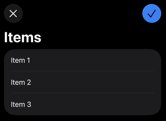
As you can see in the example above, we use the same toolbar view modifier in pair with the ToolbarItem type. The new design language moves away from text-based toolbar items to symbol-based. So, remember to use buttons with both images and text labels.
Whenever you support platforms before Liquid Glass, you may need to keep the old text-based toolbar items. You can easily achieve that by using the labelStyle view modifier.
struct ContentView: View {
    var body: some View {
        NavigationStack {
            List {
                Text("Item 1")
                Text("Item 2")
                Text("Item 3")
            }
            .navigationTitle("Items")
            .toolbar {
                ToolbarItem(placement: .cancellationAction) {
                    Button("Cancel", systemImage: "xmark") {

                    }
                    .labelStyle(.toolbar)
                }

                ToolbarItem(placement: .confirmationAction) {
                    Button("Done", systemImage: "checkmark") {

                    }
                    .labelStyle(.toolbar)
                }
            }
        }
    }
}
As you can see, we use the labelStyle view modifier with the toolbar style. The toolbar style doesn’t come as the part of SwiftUI framework; instead, we create it manually.
struct ToolbarLabelStyle: LabelStyle {
    func makeBody(configuration: Configuration) -> some View {
        if #available(iOS 26, *) {
            Label(configuration)
        } else {
            Label(configuration)
                .labelStyle(.titleOnly)
        }
    }
}

@available(iOS, introduced: 18, obsoleted: 26, message: "Remove this property in iOS 26")
extension LabelStyle where Self == ToolbarLabelStyle {
    static var toolbar: Self { .init() }
}
It is pretty easy to define a custom label style. We check the availability of the Liquid Glass and apply necessary styling. We also mark the style as obsolete in iOS 26, which will be an error when you change the target of your project to iOS 26, so it becomes unnecessary and you can remove it.
ToolbarItemPlacement become really important while adopting Liquid Glass, because it controls not only placement but also the way it looks. For example, we use the confirmationAction placement, and it applies the glassProminent button style.
struct ContentView: View {
    var body: some View {
        NavigationStack {
            List {
                Text("Item 1")
                Text("Item 2")
                Text("Item 3")
            }
            .navigationTitle("Items")
            .toolbar {
                ToolbarItem(placement: .cancellationAction) {
                    Button("Cancel", systemImage: "xmark") {

                    }
                    .labelStyle(.toolbar)
                    .tint(.red)
                }

                ToolbarItem(placement: .confirmationAction) {
                    Button("Done", systemImage: "checkmark") {

                    }
                    .labelStyle(.toolbar)
                    .badge(3)
                }
            }
        }
    }
}
Liquid Glass allows us to tint toolbar items using the tint view modifier and badge them using the badge view modifier. But use it wisely, it is not something you are going to use often, instead rely on toolbar placement API.
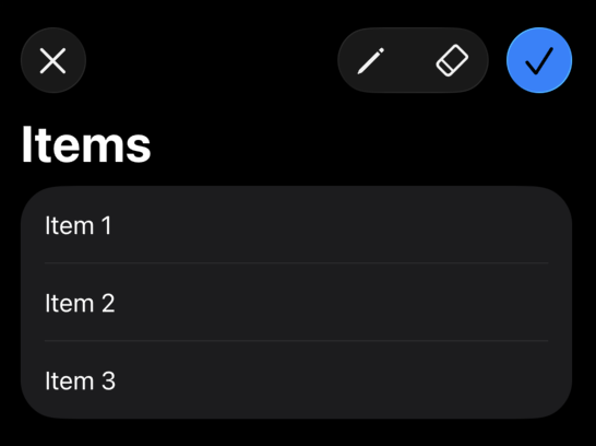
The new Liquid Glass provides us the new toolbar grouping functionality. For example, you can group a bunch of secondary actions together by splitting them from the primary action.
struct ToolsToolbar: ToolbarContent {
    var body: some ToolbarContent {
        ToolbarItem(placement: .cancellationAction) {
            Button("Cancel", systemImage: "xmark") {}
        }

        ToolbarItemGroup(placement: .primaryAction) {
            Button("Draw", systemImage: "pencil") {}
            Button("Erase", systemImage: "eraser") {}
        }

        ToolbarSpacer(.flexible)

        ToolbarItem(placement: .confirmationAction) {
            Button("Save", systemImage: "checkmark") {}
        }
    }
}
SwiftUI introduced the new ToolbarSpacer type allowing us to split toolbar items and place the space between them. You can apply fixed or flexible spacing between toolbar items.
To wrap up, Liquid Glass marks a significant evolution in Apple’s design language, and toolbars are at the center of this transformation. With their new glassy appearance, grouped layouts, and symbolic button emphasis, toolbars now offer a more modern and visually cohesive experience across platforms. I hope you enjoy the post. Feel free to follow me on Twitter and ask your questions related to this post. Thanks for reading, and see you next week!