Building List replacement in SwiftUI
Whenever you consider creating a scrollable screen in SwiftUI, you might think of using a List. However, it’s not always the best choice. Lists are great for displaying uniform data. For anything else, a ScrollView with a lazy stack is almost always the best option. This week, we will learn how to build a custom scrollable container in SwiftUI with precise control of look and feel.
First of all, I should mention that over the last few years SwiftUI has significantly improved the performance of ScrollView in pairs with lazy stacks. So, if you are not displaying hundreds of thousands of uniform data like mailboxes or to-do lists, the ScrollView is a way to go.
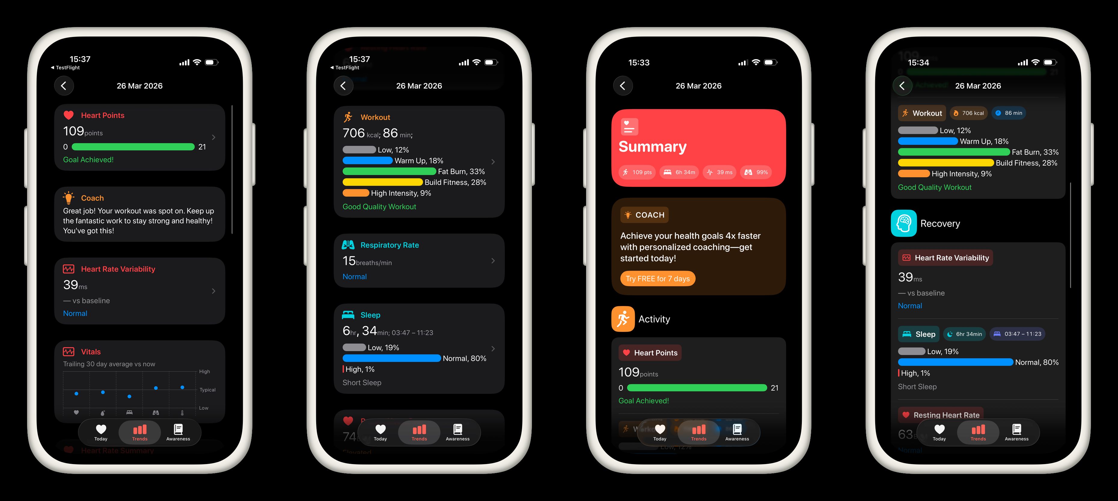
You can see 4 screenshots here. The first two of them represent the current state of my CardioBot app. The next two screenshots are the result I want to achieve. As you might notice, I use a standard List at the very moment, and I really like how the app looks and feels now. But I’ve decided to reconsider my UI. I want to keep it simple and recognizable for iPhone users, but I would like to make the UI more fancy.
As you can see, my app displays different health metrics. It is not a uniform data set, and it doesn’t make any sense to use the List for recycling cells. I use multiple card types like HeroCard, TintedCard, and RegularCard. I can achieve a similar look and feel using List and list-specific view modifiers like listRowBackground, listItemTint, and listRowInsets. Unfortunately, these list-specific view modifiers don’t work outside of the List view, which requires additional styling outside the List.
Fortunately, SwiftUI introduced Container View APIs that we can use to build a List-replacement. Container View APIs allow us to decompose SwiftUI views, apply some changes, and compose again. So, we can use the Container View APIs to build reusable container views like List, Form, or anything super custom.
public struct ScrollingSurface<Content: View>: View {
    public enum Direction {
        case vertical(HorizontalAlignment)
        case horizontal(VerticalAlignment)
    }

    let direction: Direction
    let spacing: CGFloat?
    let content: Content

    public init(
        _ direction: Direction = .vertical(.leading),
        spacing: CGFloat? = nil,
        @ViewBuilder content: () -> Content
    ) {
        self.spacing = spacing
        self.direction = direction
        self.content = content()
    }

    public var body: some View {
        switch direction {
        case .horizontal(let alignment):
            ScrollView(.horizontal) {
                LazyHStack(alignment: alignment, spacing: spacing) {
                    content
                }
                .scrollTargetLayout()
                .padding()
            }
        case .vertical(let alignment):
            ScrollView(.vertical) {
                LazyVStack(alignment: alignment, spacing: spacing) {
                    content
                }
                .scrollTargetLayout()
                .padding()
            }
        }
    }
}
Every screen in my app uses ScrollView with a lazy stack. So, I’ve created the ScrollingSurface type. As you can see, it is a simple wrapper around the ScrollView and LazyVStack or LazyHStack depending on the chosen direction. I will use the ScrollingSurface type as the root view on every screen of my app.
public struct DividedCard<Content: View>: View {
    let content: Content

    public init(@ViewBuilder content: () -> Content) {
        self.content = content()
    }

    public var body: some View {
        Group(subviews: content) { subviews in
            if !subviews.isEmpty {
                VStack(alignment: .leading) {
                    ForEach(subviews) { subview in
                        subview

                        if subviews.last?.id != subview.id {
                            Divider()
                                .padding(.vertical, 8)
                        }
                    }
                }
                .padding()
                .frame(maxWidth: .infinity, alignment: .topLeading)
                .background(.regularMaterial, in: RoundedRectangle(cornerRadius: 32))
            }
        }
    }
}
Next most important primitive for UI is the DividedCard type. As you can see, it uses Group(subviews:) which is a part of SwiftUI Container View API. This initializer of the Group type allows us to decompose the view passed with a ViewBuilder closure.
To learn more about Container View APIs in SwiftUI, take a look at my dedicated “Mastering container views in SwiftUI. Basics.” post.
In the DividedCard view, we decompose the passed view and add the divider after each child view. In the end, we wrap the whole view with a background with rounded corners to make it feel like a card.
public struct SectionedSurface<Content: View>: View {
    let content: Content

    public init(@ViewBuilder content: () -> Content) {
        self.content = content()
    }

    public var body: some View {
        ForEach(sections: content) { section in
            if !section.content.isEmpty {
                section.header.padding(.top)
                section.content
                section.footer
            }
        }
    }
}
Another interesting UI primitive I built is the SectionedSurface. It uses ForEach(sections:) which allows us to extract all the sections from the passed view and filter out the sections without content and add some paddings to section headers.
public struct NavigationButtonStyle: ButtonStyle {
    public func makeBody(configuration: Configuration) -> some View {
        HStack {
            configuration.label
                .opacity(configuration.isPressed ? 0.7 : 1)
            Spacer()
            Image(systemName: "chevron.right")
                .foregroundStyle(.tertiary)
        }
        .contentShape(.rect)
    }
}

extension ButtonStyle where Self == NavigationButtonStyle {
    public static var navigation: Self { .init() }
}
One thing you can miss from using List view in SwiftUI is the styling of a NavigationLink. List automatically adds the chevron on the trailing edge of a NavigationLink. Fortunately, we can achieve that using a custom button style.
public struct SummaryView: View {
    let summary: SummaryStore

    public var body: some View {
        ScrollingSurface {
            SectionedSurface {
                coachSection
                activitySection
                recoverySection
                vitalsSection
                heartRateSection
                alcoholicBeveragesSection
            }
        }
        .buttonStyle(.navigation)
    }

    @ViewBuilder private var activitySection: some View {
        Section {
            if !summary.metrics.workouts.isEmpty {
                DividedCard {
                    ForEach(summary.metrics.workouts, id: \.workout.uuid) { snapshot in
                        NavigationLink {
                            WorkoutDetailsView(snapshot: snapshot)
                        } label: {
                            WorkoutView(snapshot: snapshot)
                        }
                    }
                }
            }
        } header: {
            SectionHeader(
                .horizontal,
                title: Text("activitySection"),
                systemImage: "figure.run"
            )
            .tint(.orange)
        }
    }
}
Here is the code from my app showing the usage of the new UI primitives we built earlier. As you can see, we have very similar usage to the List API, but also have precise control of look and feel which allows us to reuse these primitives on screens without sections just by removing SectionedSurface.
Replacing List in SwiftUI is not about abandoning a powerful component—it’s about choosing the right tool for the job. While List remains an excellent choice for large, uniform datasets, modern SwiftUI gives us the flexibility to build something more tailored when our UI demands it.
By leveraging ScrollView with lazy stacks and the Container View APIs, we can recreate—and even surpass—the capabilities of List. Custom primitives like ScrollingSurface, DividedCard, and SectionedSurface demonstrate how we can compose reusable building blocks that match our product’s design language while maintaining performance and clarity. I hope you enjoy the post. Feel free to follow me on Twitter and ask your questions related to this post. Thanks for reading, and see you next week!