Adapting your app for iPhone Duo
iPhone Duo became the first folding iPhone providing us with two displays of different sizes and aspect ratios. This week, we will talk about adapting our apps to different screen sizes using simple techniques that Apple UI frameworks provide us.
As soon as you adapt the app to iPad you have almost done the biggest part of the job. Let’s think that we start from scratch and didn’t adapt our app to the iPad layout yet. First of all, you should never use screen bounds or device idioms. All you need is size classes that you should observe and adapt to.
Size classes can be regular or compact; for example, iPhone has a compact horizontal size class in portrait mode, whereas iPhone Duo has a compact horizontal size class in the folded state and a regular horizontal size class in the unfolded state.
Most of your apps use TabView or NavigationSplitView as the root navigation components. Fortunately, both of them adapt to the regular horizontal size class.
struct RootView: View {
    var body: some View {
        TabView {
	  // tabs
	}
	.tabViewStyle(.sidebarAdaptable)
        .defaultTabBarPlacement(.sidebar)
    }
}
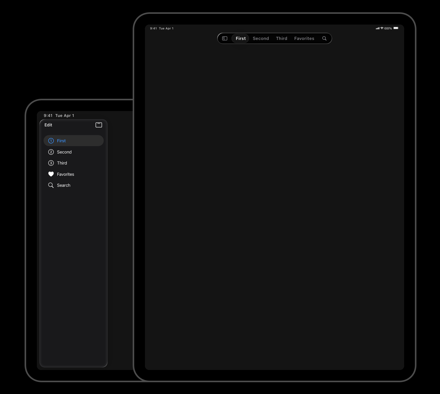
As you can see in the example above, we use sidebarAdaptable style on TabView which will use a two-pane sidebar when the horizontal size class is regular and collapse in the standalone TabView in a compact size class. NavigationSplitView also adapts to size classes by displaying a single-pane navigation in compact mode and switching to multi-pane navigation in a regular horizontal size class.
We also use the defaultTabBarPlacement view modifier, allowing us to set the default placement for the tab bar on platforms where you can choose the placement. For example, on iPhone tab bar lives at the bottom of the screen and we can’t change it, but on iPhone Duo, it can adapt to the sidebar.
Another technique that we might need to use in our apps is dynamic layout switching. For example, it might be useful while transitioning from the folded to the unfolded state of iPhone Duo.
public struct FoodDetailsView: View {
    @Environment(\.horizontalSizeClass) private var horizontalSize

    public var body: some View {
        let layout = horizontalSize == .compact ?
        AnyLayout(VStackLayout()) :
        AnyLayout(HStackLayout())

	layout {
	  // your content here
	}
    }
}
As you can see, we use AnyLayout type, allowing us to switch layouts without losing structured identity and allowing smooth and animatable transitions between states.
Xcode provides you with the App Resizability skill that your agent can use to make all of this work for you. All you need to do is prompt your agent with this text: “Adopt the app to iPhone Duo.”
Adapting your app for iPhone Duo doesn’t require reinventing your UI. By embracing size classes, adaptive navigation components, and flexible layouts, you can build interfaces that naturally adjust between folded and unfolded states.
The best part is that these techniques aren’t specific to iPhone Duo. They make your app more flexible across the entire Apple ecosystem, from iPhone and iPad to Mac. With SwiftUI doing most of the heavy lifting, supporting a new form factor becomes less about writing device-specific code and more about building truly adaptive interfaces. I hope you enjoy the post. Feel free to follow me on Twitter and ask your questions related to this post. Thanks for reading, and see you next week!