Gradient in SwiftUI
One thing which I really enjoy about SwiftUI is the fact that SwiftUI has a lot of stuff ready to use out of the box. In order to build your app, all you need to do is composing the building blocks provided by SwiftUI into a fully functional application. This week we will talk about Gradient, which is just another type of View in SwiftUI.
As I already said, Gradient is one of the View protocol’s implementations. You can easily use Gradient anywhere in the app where you can use other View components like Text or Button. SwiftUI provides three types of Gradient component. Let’s take a look at them one by one.
LinearGradient
LinearGradient is one of the basic types of Gradient. It draws colors from the start point to the end point. I think the best way to understand gradients is just writing the code and check the results. Let’s try it.
import SwiftUI

struct ContentView: View {
    var body: some View {
        LinearGradient(
            gradient: Gradient(colors: [.red, .white]),
            startPoint: .top,
            endPoint: .bottom
        )
    }
}
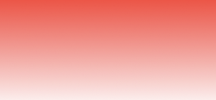
As you can see, LinearGradient applies red to white transition from top to bottom as we pointed it in the code. Start and end points are the cases of UnitPoint enum. These points can take the following values: .zero, .center, leading, trailing, top, bottom, topLeading, topTrailing, bottomLeading, bottomTrailing. SwiftUI uses these unit point values to convert the declarative description into real coordinates of the view. Let’s check another unit point values.
import SwiftUI

struct ContentView: View {
    var body: some View {
        LinearGradient(
            gradient: Gradient(colors: [.red, .white]),
            startPoint: .leading,
            endPoint: .trailing
        )
    }
}
I’ve changed the start and end points to leading and trailing. It will help us to understand the meaning of unit points better, and here is the result.

LinearGradient is a commonly used gradient type. You can use it as a background for a Text component, which you might want to draw ahead of an Image.
RadialGradient
RadialGradient applies color transformation from the defined center point to its circle edge, which is calculated using the start and end radius. Let’s take a look at a quick example of RadialGradient.
import SwiftUI

struct ContentView: View {
    var body: some View {
        RadialGradient(
            gradient: Gradient(colors: [.orange, .white]),
            center: .center,
            startRadius: 1,
            endRadius: 200
        )
    }
}

I suggest you play around the RadialGradient with more colors and different center positions to understand it even better.
import SwiftUI

struct ContentView: View {
    var body: some View {
        RadialGradient(
            gradient: Gradient(colors: [.orange, .white, .orange, .white]),
            center: .center,
            startRadius: 1,
            endRadius: 200
        )
    }
}

Sometimes we need to use RadialGradient inside the GeometryReader to calculate proper radius value relative to the parent’s size. To learn more about GeometryReader, take a look at “Building BarChart with Shape API in SwiftUI” post.
AngularGradient
The last type of Gradient which we have in SwiftUI is AngularGradient. I’m not using it very ofter, but it has a very nice color transformation effect. AngularGradient also is known as the conic Gradient. This Gradient type applies color transformation as the angle changes, relative to a center point. Let’s check out the code sample and resulting image.
import SwiftUI

struct ContentView: View {
    var body: some View {
        AngularGradient(
            gradient: Gradient(colors: [.orange, .white]),
            center: .center
        )
    }
}

Let’s take a look at a different example by adding more colors to the Gradient.
import SwiftUI

struct ContentView: View {
    var body: some View {
        AngularGradient(
            gradient: Gradient(
                colors: [
                    .orange, .white, .orange, .white, .orange, .white, .orange, .white, .orange
                ]
            ),
            center: .center
        )
    }
}
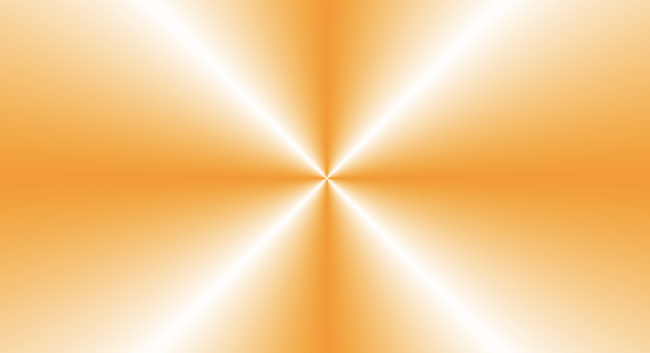
By default, SwiftUI provides us AngularGradient with start and end angles, which equal to zero, but you can adjust them by using another overload of the initializer.
Conclusion
This week we learned how to use Gradients in SwiftUI. I usually use only LinearGradient to cover my images and then put some text on top of them, but who knows which crazy designs your designer will bring you. I hope you enjoy the post. Feel free to follow me on Twitter and ask your questions related to this post. Thanks for reading, and see you next week!