Building Bottom sheet in SwiftUI
This week I want to start a series of posts about building interactive view components that Apple heavily uses in its apps but doesn’t include them into the SDK. Let’s begin with the bottom sheet. I think everybody used Apple Maps, Shortcut or Apple Music apps. There is a draggable sheet at the bottom of the screen. It looks like bottom sheet is going to be a must-use component, so let’s try to implement it in SwiftUI.
Compare designs, show rulers, add a grid, quick actions for recent builds. Create recordings with touches & audio, trim and export them into MP4 or GIF and share them anywhere using drag & drop. Add bezels to screenshots and videos. Try now
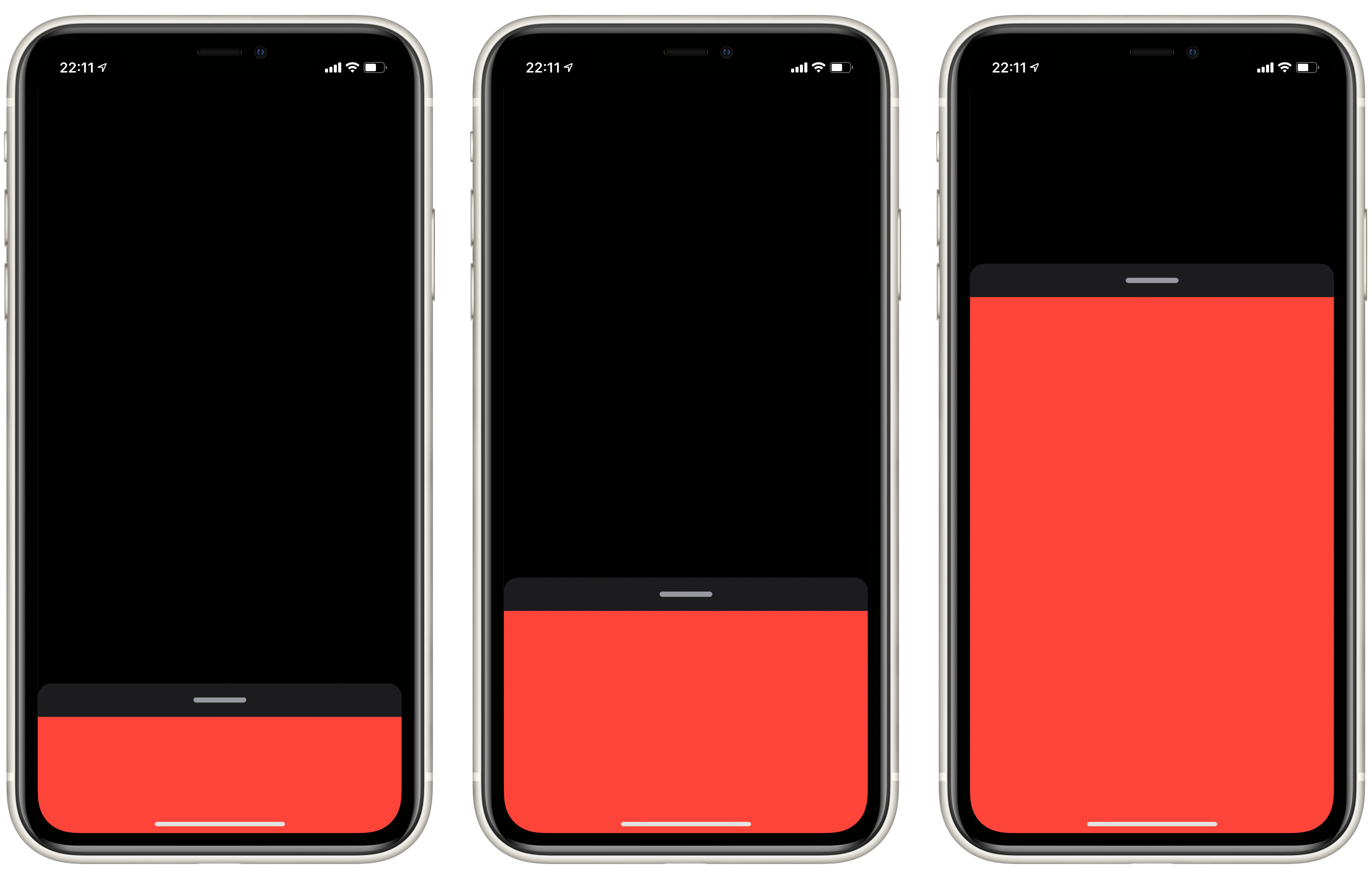
Usually, when I deal with interactive components, I start with implementing the component in different states. After that, we can add the gesture which manipulates the state of the component. In our case, we deal with the bottom sheet. It has two different states: open and closed. Let’s start by describing our view and all the needed properties which should be passed by the parent view.
import SwiftUI

struct BottomSheetView<Content: View>: View {
    @Binding var isOpen: Bool

    let maxHeight: CGFloat
    let minHeight: CGFloat
    let content: Content

    init(isOpen: Binding<Bool>, maxHeight: CGFloat, @ViewBuilder content: () -> Content) {
        self.minHeight = maxHeight * Constants.minHeightRatio
        self.maxHeight = maxHeight
        self.content = content()
        self._isOpen = isOpen
    }
}
As you can see, we started with defining a few properties of BottomSheetView. First of all, it needs a binding to its state. By using binding, we extract the state from the bottom sheet itself and allow the parent view to open/close the sheet.
To learn more about the benefits of @Binding take a look at “Understanding Property Wrappers in SwiftUI” post.
We also require the maximum height which we will use whenever the sheet is open, and we calculate the minimum height to use it whenever the sheet is closed.
The last parameter we need is the content closure with @ViewBuilder function builder. @ViewBuilder allows us to use closure to build the content view of our bottom sheet. Other view containers like VStack, HStack, ZStack also use @ViewBuilder to describe content closure. Let’s make it similar to standard SwiftUI components.
We already defined all the needed public properties. Let’s place the content now.
private var offset: CGFloat {
    isOpen ? 0 : maxHeight - minHeight
}

private var indicator: some View {
    RoundedRectangle(cornerRadius: Constants.radius)
        .fill(Color.secondary)
        .frame(
            width: Constants.indicatorWidth,
            height: Constants.indicatorHeight
    )
}

var body: some View {
    GeometryReader { geometry in
        VStack(spacing: 0) {
            self.indicator.padding()
            self.content
        }
        .frame(width: geometry.size.width, height: self.maxHeight, alignment: .top)
        .background(Color(.secondarySystemBackground))
        .cornerRadius(Constants.radius)
        .frame(height: geometry.size.height, alignment: .bottom)
        .offset(y: self.offset)
    }
}
The vertical stack is all we need to place the dragging indicator and content of the bottom sheet. We also use Shape API to draw the dragging symbol programmatically, which is really simple. GeometryReader provides all the needed information about the size of the parent view that allows us properly place our view. We use the offset modifier to move our view, depending on its state.
To learn more about Shape API and GeometryReader take a look at “Building BarChart with Shape API in SwiftUI” post.
The last step is to attach the drag gesture and move the view whenever the user drags the finger. Let’s see how we can do that.
@GestureState private var translation: CGFloat = 0

var body: some View {
    GeometryReader { geometry in
        VStack(spacing: 0) {
            self.indicator.padding()
            self.content
        }
        .frame(width: geometry.size.width, height: self.maxHeight, alignment: .top)
        .background(Color(.secondarySystemBackground))
        .cornerRadius(Constants.radius)
        .frame(height: geometry.size.height, alignment: .bottom)
        .offset(y: max(self.offset + self.translation, 0))
        .animation(.interactiveSpring(), value: isOpen)
        .animation(.interactiveSpring(), value: translation)
        .gesture(
            DragGesture().updating(self.$translation) { value, state, _ in
                state = value.translation.height
            }.onEnded { value in
                let snapDistance = self.maxHeight * Constants.snapRatio
                guard abs(value.translation.height) > snapDistance else {
                    return
                }
                self.isOpen = value.translation.height < 0
            }
        )
    }
}
In the code sample above, we attach the drag gesture to the view and modify its state as soon as it ends. Besides that, we update the gesture state to make it interactive. The main benefit of @GestureState is its behavior. SwiftUI resets the value of the @GestureState to its initial value as soon as gesture ends. We use the value of @GestureState by adding it to the offset, which allows us to drive our view interactively.
To learn more about gestures and @GestureState take a look at “Gestures in SwiftUI” post.
Let’s finally use our bottom sheet to check how it works.
struct ContentView: View {
    @State private var bottomSheetShown = false

    var body: some View {
        GeometryReader { geometry in
            Color.green
            BottomSheetView(
                isOpen: self.$bottomSheetShown,
                maxHeight: geometry.size.height * 0.7
            ) {
                Color.blue
            }
        }.edgesIgnoringSafeArea(.all)
    }
}
Full source code available here
Conclusion
Today we learned how we could build a draggable bottom sheet component, which Apple uses a lot in its apps. Building interactive components is really straightforward in SwiftUI. All you need to do is defining the state and the gesture which modifies the state. SwiftUI animates all the transitions between state changes for free for you. I hope you enjoy the post. Feel free to follow me on Twitter and ask your questions related to this post. Thanks for reading, and see you next week!