Mastering charts in SwiftUI. Accessibility.
The last but not least post in the series is about accessibility. It is essential to make your app accessible to VoiceOver users. Usually, it is much harder to make your visual content accessible. Fortunately, Apple provides audio graph features allowing us to make any chart representable with sound. This week we will learn how to improve the accessibility of our graphs using the Swift Charts framework.
Compare designs, show rulers, add a grid, quick actions for recent builds. Create recordings with touches & audio, trim and export them into MP4 or GIF and share them anywhere using drag & drop. Add bezels to screenshots and videos. Try now
First of all, I should mention that the Swift Charts framework understands your data and build an accessibility tree for your chart automatically for free. You don’t need to do any specific steps to make your chart accessible with the Swift Charts framework.
To learn more about the basics of the Charts framework, take a look at my dedicated “Mastering charts in SwiftUI. Basics.” post.
But remember that you should provide meaningful labels within instances of the PlottableValue type. The Swift Charts framework will use these labels to provide information to your VoiceOver users. Let’s take a look at a quick example.
import SwiftUI
import Charts

enum Gender: String, CaseIterable {
    case male
    case female
    case notSet
}

extension Gender: Plottable {
    var primitivePlottable: String {
        rawValue
    }
}

struct Stats {
    let city: String
    let population: Int
    let gender: Gender
}

struct ContentView: View {
    let stats: [Stats]

    var body: some View {
        Chart {
            ForEach(stats, id: \.city) { stat in
                BarMark(
                    x: .value(Text(verbatim: "City"), stat.city),
                    y: .value("Population", stat.population)
                )
                .foregroundStyle(by: .value("Gender", stat.gender))
            }
        }
    }
}
As you can see in the example above, we use City, Population, and Gender strings as instances of the LocalizedStringKey type. Fortunately, the PlottableValue type provides a few overloads allowing us to use String, LocalizedStringKey, and Text as its label.
The Swift Charts automatically group accessibility elements for the same cities, calculate the total population per city and provide it as accessibility value.
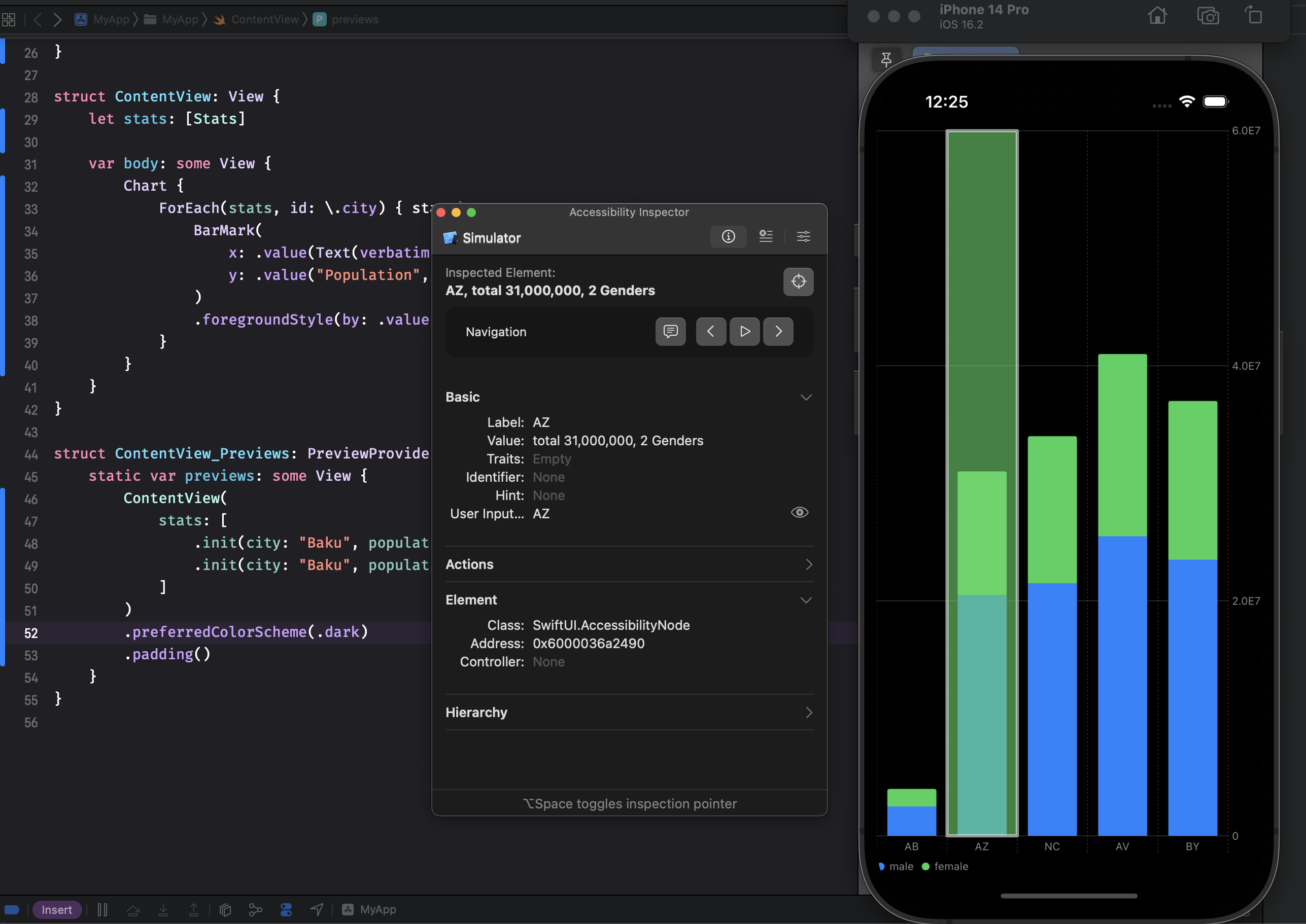
Whenever you need to provide additional information for your data point, you can always use the accessibilityLabel and accessibilityValue modifiers on your mark type.
struct ContentView1: View {
    let stats: [Stats]

    var body: some View {
        Chart {
            ForEach(stats.filter { $0.gender == .female }, id: \.city) { stat in
                BarMark(
                    x: .value(Text(verbatim: "City"), stat.city),
                    y: .value("Population", stat.population)
                )
                .accessibilityValue("Female population: \(stat.population)")
            }
        }
    }
}
As you can see in the example above, we use the accessibilityValue modifier on the BarMark type to provide meaningful information about its value.
iOS 15 and later versions have a feature called audio graphs. It allows to represent any visual information using sounds and works excellently with charts. Fortunately, we don’t need to do anything to support audio graphs. The Swift Charts framework extracts valuable information from your data and builds audio graphs automatically.
Audio graphs are available via the rotors menu. To use the rotor, rotate two fingers on your iOS device’s screen as if you’re turning a dial. VoiceOver will say the first rotor option. Keep rotating your fingers to hear more options. Lift your fingers to choose audio graphs. Then flick your finger up or down on the screen to navigate to chart details and double-tap to select it.
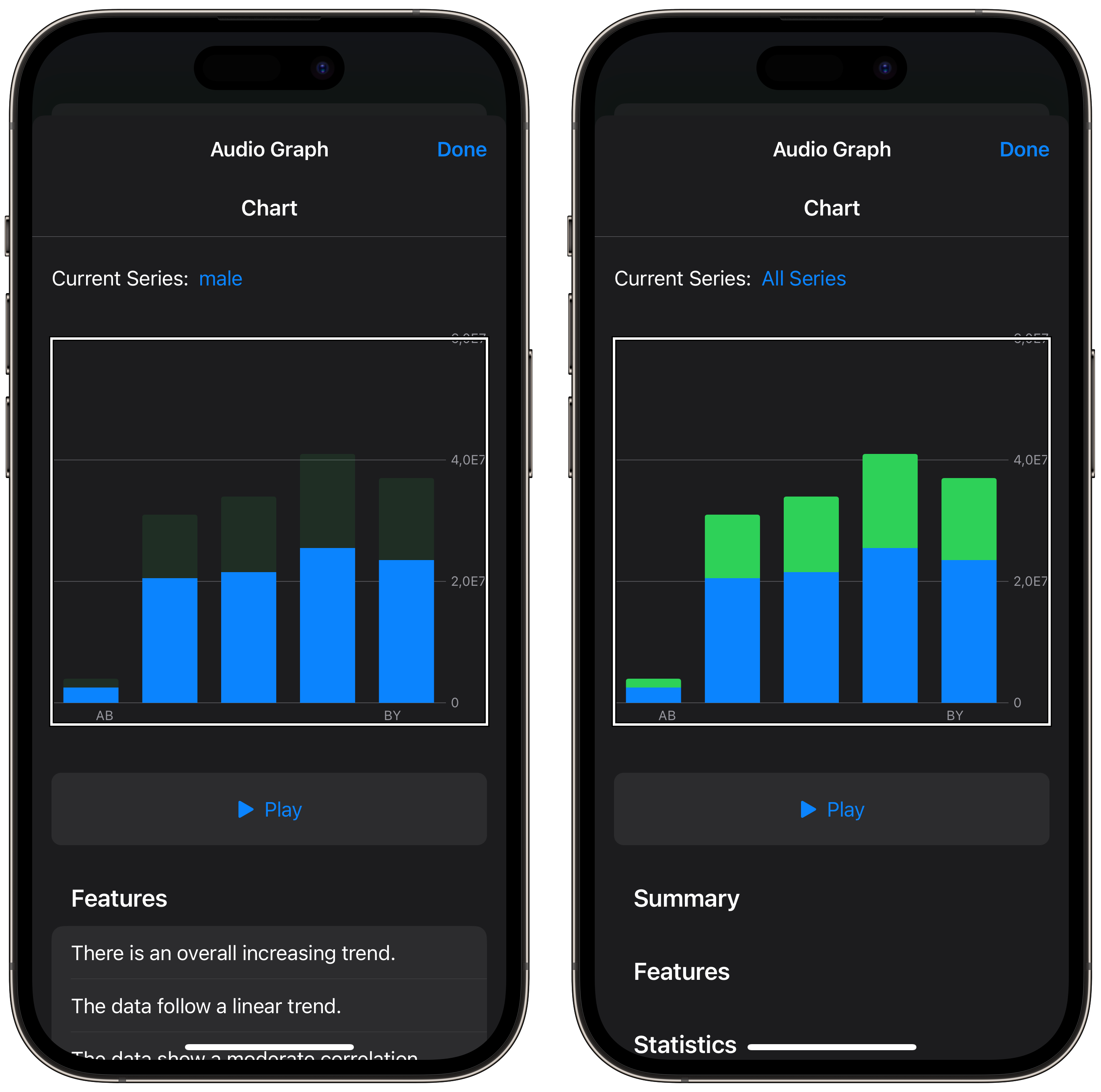
As you can see, the Swift Charts framework understands your data series, builds summary and statistics from your data, and displays it in the audio graph menu automatically.
Accessibility isn’t a feature or a “nice to have”. It’s a necessity. So let’s make your app accessible for everyone. I hope you enjoy the post. Feel free to follow me on Twitter and ask your questions related to this post. Thanks for reading, and see you next week!