The many faces of ShapeStyle in SwiftUI
ShapeStyle is the protocol that we have from the very first release of the SwiftUI framework. ShapeStyle defines a color or pattern to use when rendering a shape. This week we will learn the many faces of ShapeStyle protocol and different implementations provided by the SwiftUI framework.
Colors
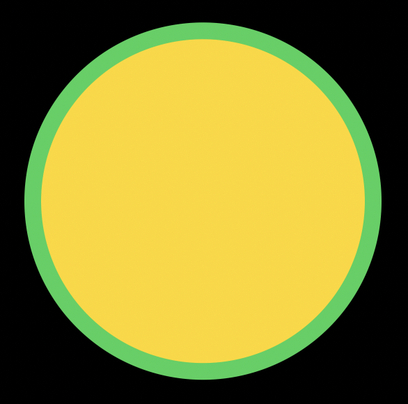
Usually, we don’t use the ShapeStyle protocol itself. We use the many implementations of the protocol that SwiftUI provides us. One of them is the Color struct. We can use an instance of the Color struct to fill or stroke a shape in SwiftUI. Let’s take a look at the quick example.
struct ContentView: View {
    var body: some View {
        ZStack {
            Circle()
                .fill(Color.yellow)
            Circle()
                .stroke(Color.green, lineWidth: 16)
        }
        .padding(32)
    }
}
We can also use a ShapeStyle as a background or overlay for any view.
struct ContentView: View {
    var body: some View {
        ZStack {
            Text("Hello, World!")
                .background(Color.red)
        }
        .padding(32)
    }
}
Gradients
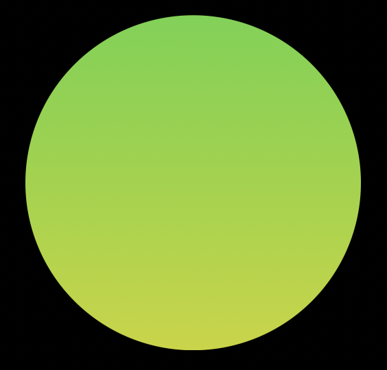
Another implementation of the ShapeStyle protocol is gradients. You can use gradients anywhere in SwiftUI to provide an instance of the ShapeStyle protocol.
struct ContentView: View {
    var body: some View {
        ZStack {
            Circle()
                .fill(
                    LinearGradient(
                        colors: [.green, .yellow],
                        startPoint: .top,
                        endPoint: .bottom
                    )
                )
        }
        .padding(32)
    }
}
To learn more about gradients, take a look at my dedicated “Gradient in SwiftUI” post.
Hierarchical
SwiftUI provides us a shape style that maps to one of the numbered content styles. It has a few static instances: primary, secondary, tertiary, quaternary. You can use one of them whenever you need to use the hierarchical styling of the content.
struct ContentView: View {
    var body: some View {
        ZStack {
            Circle()
                .fill(.quaternary)
        }
        .padding(32)
    }
}
Selection
There is a special implementation of the ShapeStyle protocol called SelectionShapeStyle that defines the platform-oriented selection styling. You can use it whenever you need to highlight the selected state of the view.
struct ContentView: View {
    var body: some View {
        ZStack {
            Circle()
                .fill(SelectionShapeStyle())
        }
        .padding(32)
    }
}
Tint
TintShapeStyle is another implementation of the ShapeStyle protocol that uses the tint color. SwiftUI uses the app’s accent color by default, but you can override it using the tint view modifier.
struct ContentView: View {
    var body: some View {
        ZStack {
            Circle()
                .fill(TintShapeStyle())
        }
        .tint(Color.yellow)
        .padding(32)
    }
}
Background
BackgroundStyle type is the implementation of the ShapeStyle protocol that defines the background style in the current context. You can use it to adapt both dark and light themes.
struct ContentView: View {
    var body: some View {
        ZStack {
            Circle()
                .fill(BackgroundStyle())
        }
        .padding(32)
    }
}
Foreground
ForegroundStyle type is similar to the BackgroundStyle type but instead defines the foreground style of the current context. This one also works both in dark and light themes.
struct ContentView: View {
    var body: some View {
        ZStack {
            Circle()
                .fill(ForegroundStyle())
        }
        .padding(32)
    }
}
Material
Materials in SwiftUI conform to the ShapeStyle protocol also. It means you can use provided materials as the instance of ShapeStyle protocol anywhere in SwiftUI.
struct ContentView: View {
    var body: some View {
        ZStack {
            Circle()
                .fill(Material.ultraThin)
        }
        .padding(32)
    }
}
To learn more about materials, take a look at my dedicated “Blur effect and materials in SwiftUI” post.
ImagePaint
ImagePaint type implements the ShapeStyle protocol and fills a shape by repeating a region of an image.
struct ContentView: View {
    var body: some View {
        ZStack {
            Circle()
                .fill(ImagePaint(image: Image(systemName: "star")))
        }
        .padding(32)
    }
}
To learn more about images in SwiftUI, take a look at my dedicated “Mastering images in SwiftUI” post.
AnyShapeStyle
The last but not least type that conforms to the ShapeStyle protocol is the AnyShapeStyle type. AnyShapeStyle is the type-erased implementation of the ShapeStyle protocol that allows us to pass styles without using generics.
struct AvatarView: View {
    let style: AnyShapeStyle

    var body: some View {
        Circle()
            .fill(style)
    }
}

let style = AnyShapeStyle(TintShapeStyle())
let avatarView = AvatarView(style: style)
Conclusion
Today we learned how to use the ShapeStyle protocol and the many implementations that SwiftUI provides us. I hope you enjoy the post. Feel free to follow me on Twitter and ask your questions related to this post. Thanks for reading, and see you next week!