Mastering charts in SwiftUI. Mark styling.
Last week we started a series of posts about the new Charts framework available on the latest Apple platforms. We talked about basic stuff and learned how to plot data. This week we will continue mastering the Charts framework by learning different customization and styling options available.
Compare designs, show rulers, add a grid, quick actions for recent builds. Create recordings with touches & audio, trim and export them into MP4 or GIF and share them anywhere using drag & drop. Add bezels to screenshots and videos. Try now
As we learned in the previous post, the Charts framework provides different mark types, allowing us to plot our data differently. AreaMark, BarMark, LineMark, PointMark, RectangleMark, and RuleMark, all of these mark types let us apply modifiers we used to have in SwiftUI views.
To learn more about the basics of the Charts framework, take a look at my dedicated “Mastering charts in SwiftUI. Basics.” post.
For example, we can use the foregroundStyle modifier to change the mark’s color using any ShapeStyle we need or the opacity modifier to change the alpha of the mark.
enum Gender: String {
    case male
    case female
    case notSet
}

extension Gender: Plottable {
    var primitivePlottable: String {
        rawValue
    }
}

struct Stats {
    let city: String
    let population: Int
    let gender: Gender
}

struct ContentView1: View {
    let stats: [Stats]

    var body: some View {
        Chart {
            ForEach(stats, id: \.city) { stat in
                BarMark(
                    x: .value("City", stat.city),
                    y: .value("Population", stat.population)
                )
                .opacity(0.3)
                .foregroundStyle(.red)
            }
        }
    }
}
To learn more about the ShapeStyle protocol, take a look at my “The many faces of ShapeStyle in SwiftUI” post.
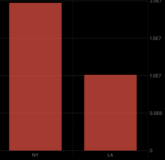
The clipShape modifier allows us to change the shape of the bar mark, and the position modifier will enable us to stack bar marks in a group differently.
struct ContentView1: View {
    let stats: [Stats]

    var body: some View {
        Chart {
            ForEach(stats, id: \.city) { stat in
                BarMark(
                    x: .value("City", stat.city),
                    y: .value("Population", stat.population)
                )
                .foregroundStyle(by: .value("Gender", stat.gender))
                .clipShape(RoundedRectangle(cornerRadius: 16))
                .position(by: .value("Gender", stat.gender))
            }
        }
    }
}
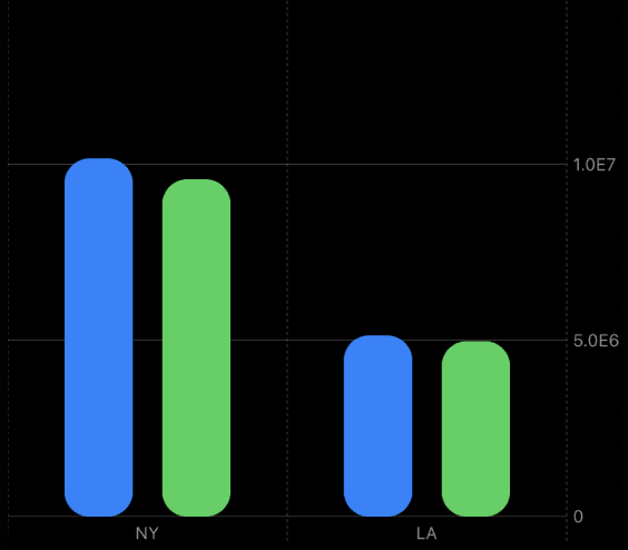
As you can see in the example above, we use the clipShape modifier to round the rectangles of our bars. We also use the position modifier to stack them horizontally. By default, the Charts framework accumulates bars in a single group vertically.
On the other hand, the LineMark type allows us to use the lineStyle modifier to change the stroke style of the plotted line. We can also use the interpolationMethod modifier to change how the framework draws the line.
struct ContentView: View {
    let numbers: [Double]

    var body: some View {
        Chart {
            RuleMark(y: .value("Limit", 50))

            ForEach(Array(numbers.enumerated()), id: \.offset) { index, value in
                LineMark(
                    x: .value("Index", index),
                    y: .value("Value", value)
                )
                .interpolationMethod(.catmullRom)
                .lineStyle(StrokeStyle(lineWidth: 1, dash: [2]))

                PointMark(
                    x: .value("Index", index),
                    y: .value("Value", value)
                )
            }
        }
    }
}
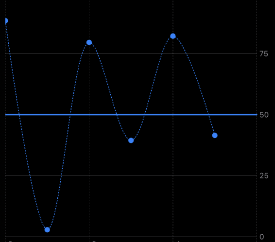
In the example above, we use the lineStyle modifier to provide a custom stroke style. Here we use particular dash values allowing us to draw the dashed line. We also apply the interpolationMethod modifier with catmullRom value to draw a curved line instead of a straight one.
The Charts framework has smart defaults and can extract value from your data to do some stuff automatically without your notice. For example, it can understand your data and color it or automatically generate a legend for your chart.
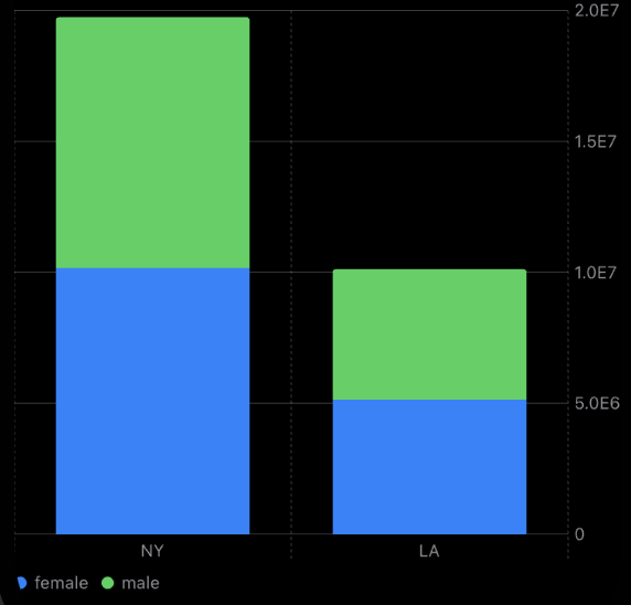
One of my favorite things about the new Charts framework is how data annotating works. You can annotate any mark on your chart with a SwiftUI view. It means you can plot your data and place SwiftUI views inside your chart close to your data point.
To learn more about the logic behind the ViewBuilder type, take a look at my “The power of @ViewBuilder in SwiftUI” post.
Annotating data points with the new Chart framework is easy. Every mark type provides us with the annotation modifier accepting a ViewBuilder closure where we can construct our SwiftUI view.
struct ContentView1: View {
    let stats: [Stats]

    var body: some View {
        Chart {
            ForEach(stats, id: \.city) { stat in
                BarMark(
                    x: .value("City", stat.city),
                    y: .value("Population", stat.population)
                )
                .clipShape(RoundedRectangle(cornerRadius: 16))
                .position(by: .value("Gender", stat.gender))
                .annotation {
                    Text(verbatim: stat.population.formatted())
                        .font(.caption)
                }
            }
        }
    }
}
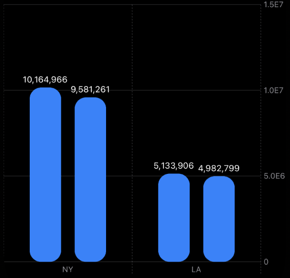
As you can see in the example above, we use the annotation modifier to place the text with the population above the bar mark. The annotation modifier also accepts the position, alignment, and spacing parameters.
struct ContentView1: View {
    let stats: [Stats]

    var body: some View {
        Chart {
            ForEach(stats, id: \.city) { stat in
                BarMark(
                    x: .value("City", stat.city),
                    y: .value("Population", stat.population)
                )
                .clipShape(RoundedRectangle(cornerRadius: 16))
                .position(by: .value("Gender", stat.gender))
                .annotation(position: .bottom, alignment: .trailing, spacing: 16) {
                    Text(verbatim: stat.population.formatted())
                        .font(.caption)
                }
            }
        }
    }
}
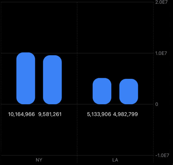
We can put an annotation under the bar, above it, or overlay it. Remember that you can place as many annotations as you need, but try to leave your charts manageable with annotations.
Today we learned how to style our data points in the new Charts framework. I hope you enjoy the post. Feel free to follow me on Twitter and ask your questions related to this post. Thanks for reading, and see you next week!